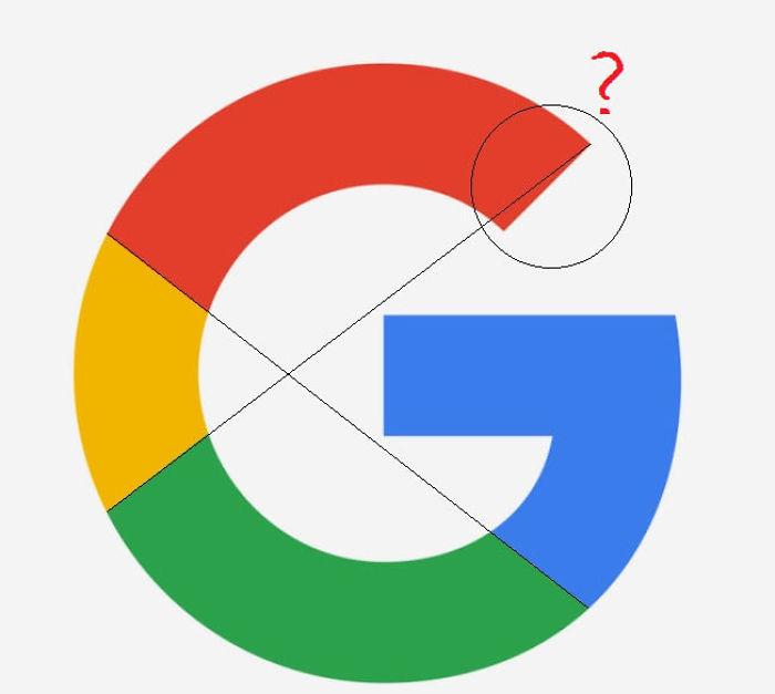
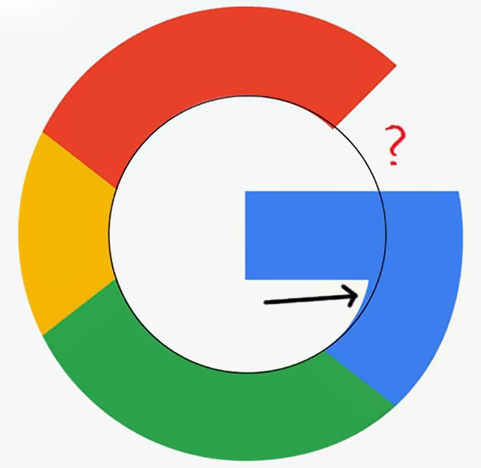
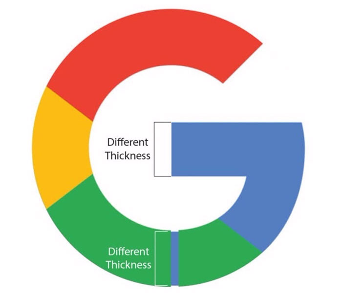
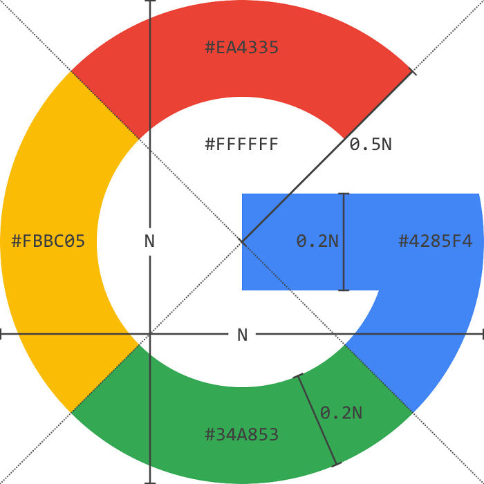
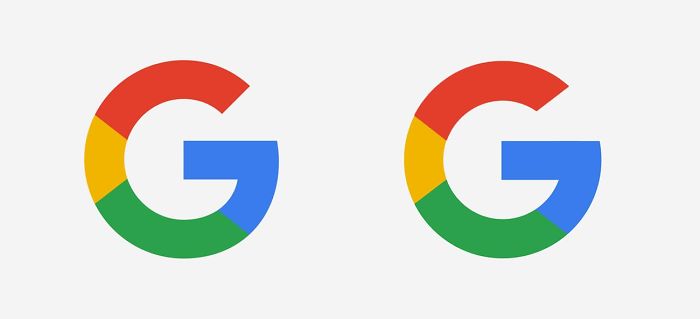
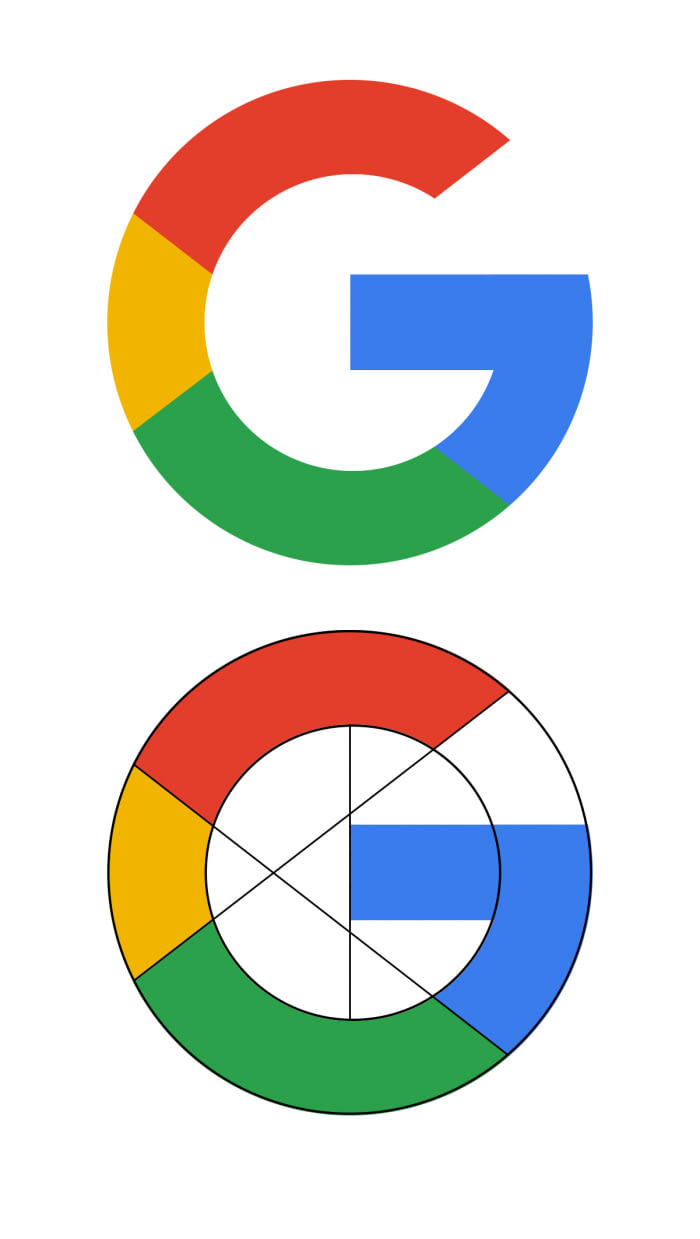
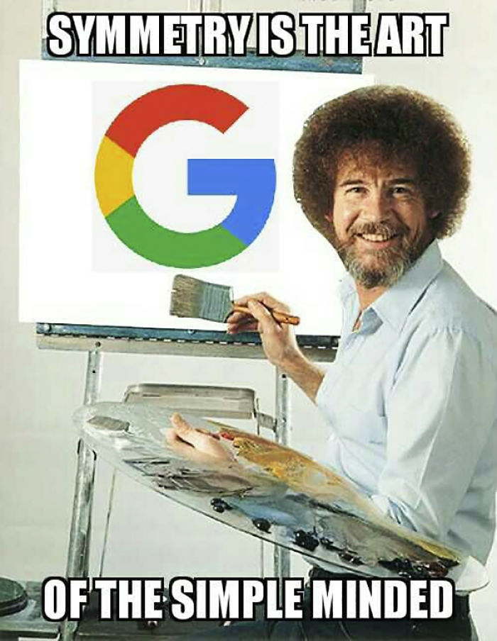
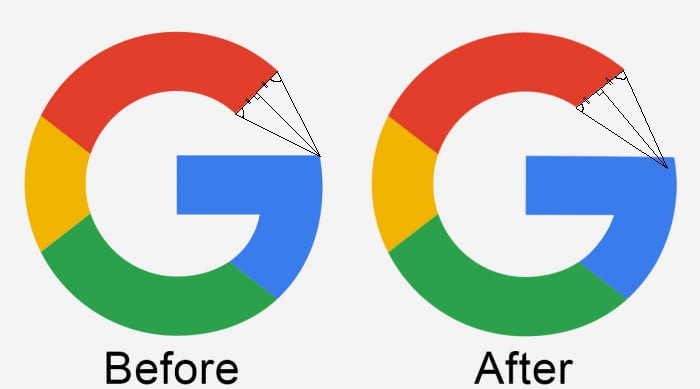
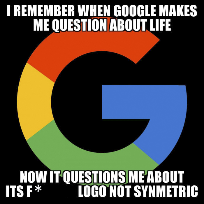
The perfectionists of the internet have pointed out how imperfect Google’s ‘G’ is and all hell has broken loose. Turns out, it’s not only the ‘G’ that’s a problem, even a bar in Chrome’s search box has imperfections. Although the logo was redesigned only 2 years ago, the internet is buzzing and people are questioning Google’s visual decisions, but there are actually very simple reasons behind them.
“The Google logo has always had a simple, friendly, and approachable style,” the company describes its identity. “We wanted to retain these qualities by combining the mathematical purity of geometric forms with the childlike simplicity of schoolbook letter printing.”
“The final logotype was tested exhaustively at various sizes and weights for maximum legibility in all the new digital contexts.” It is set in a custom sans-serif typeface and maintains the multi-colored playfulness, a reminder that Google always tries to stay unconventional.
This explanation, however, will never satisfy true geometric perfectionists. But what about you?
More info: design.google
Google logo is triggering some perfectionists
Like what you’re reading? Subscribe to our top stories.




















Discussion about this post