There are often high expectations for the finished product regarding architecture. People envision grand, awe-inspiring structures that will leave them breathless. Unfortunately, the reality can sometimes be disappointing. The final result may not live up to the hype or be plagued by various issues, such as poor functionality, shoddy construction, or an uninspired design. This can be frustrating for everyone involved, from the architects who poured their hearts and souls into the project to the people eagerly anticipating its completion. While having high expectations is essential, it’s also important to remember that reality doesn’t always match our dreams.
Architectural visualizations are crucial to a project’s design and planning phases. They help communicate ideas, gather feedback, and make informed decisions before construction begins.
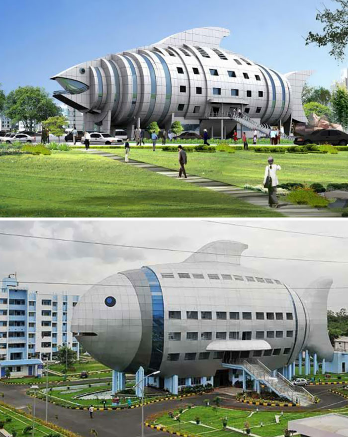
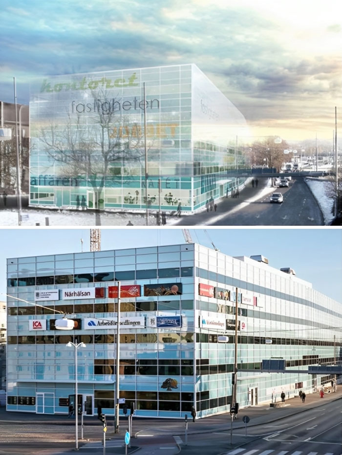
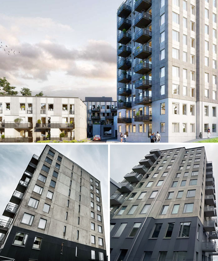
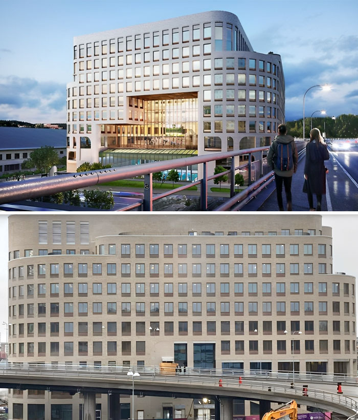
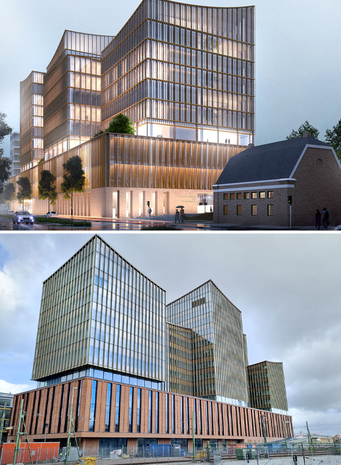
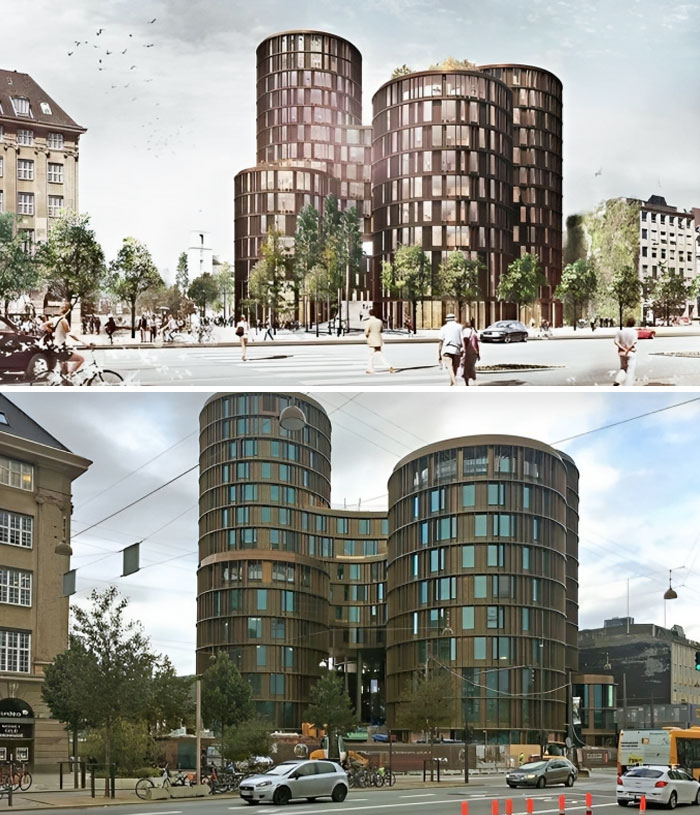
However, when you compare the finished building with its initial representation, sometimes you don’t see the shining sun reflecting in its windows and the greenery around it that’s more lush than that in the Garden of Eden.
So, to remind you that what we see isn’t always what we get, here’s a collection of pictures that exemplify the contrast between the promised ideal and reality.
01. Design Submitted By The Architect Vs. How The Contractor Ends Up Building It
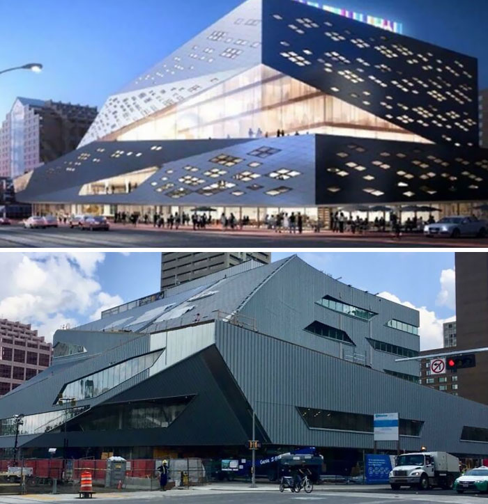
02. Stanley Milner Library In Edmonton, Alberta
At this point, the phenomenon in these pictures is virtually a trend. In one of his articles for The Guardian, British architecture and design critic Olly Wainwright explains how he tends to observe thesis projects produced by the best and brightest students in the UK.
But what he is struck by the most isn’t the technical skill or imagination, but rather the sheer lack of connection these projects have with actual, built, imperfect architecture: “Time and again, the projects seemed intent on fleeing the real world of people and places, scale and context; retreating instead into fantasy realms of convoluted forms with no seeming purpose.”
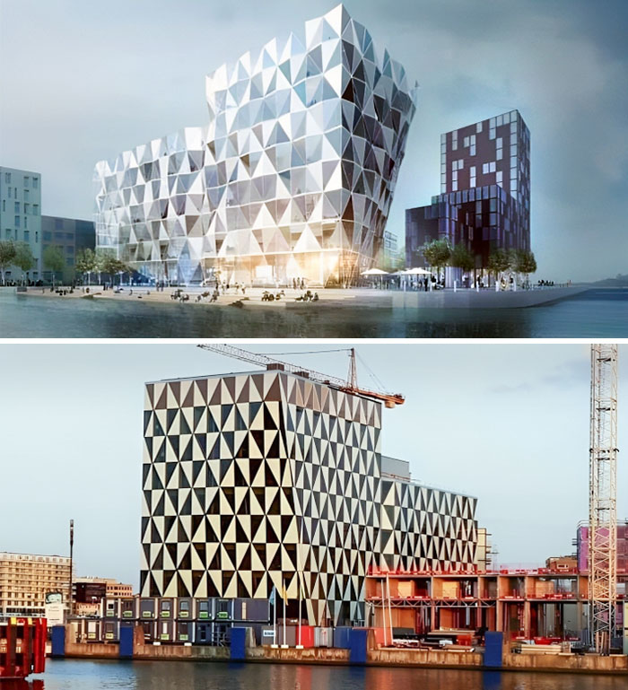
03. There Is Such A Big Difference Between The Rendered Photo And Reality. Prisma, Helsingborg, Sweden
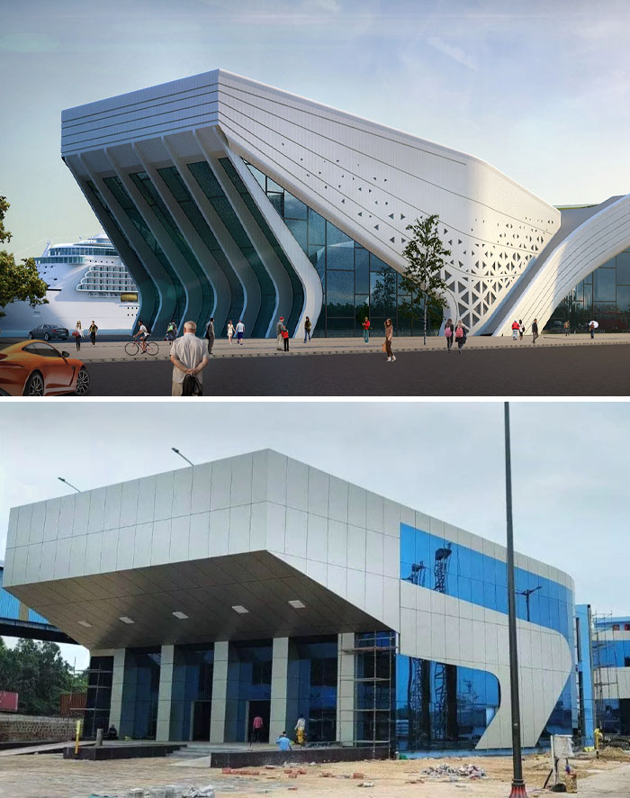
04. Vizag International Cruise Terminal In Visakhapatnam, India
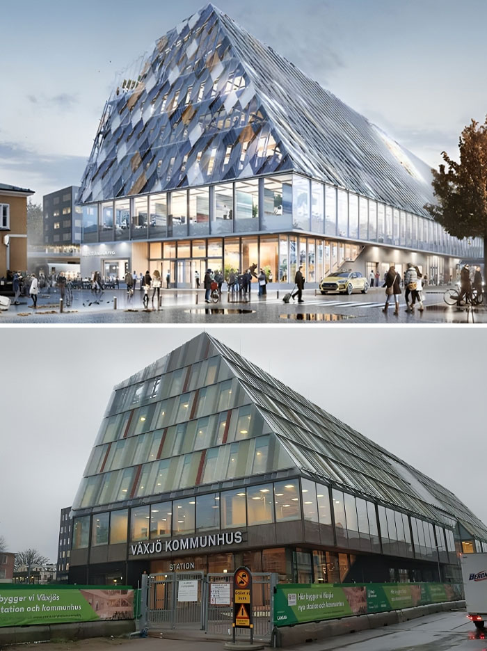
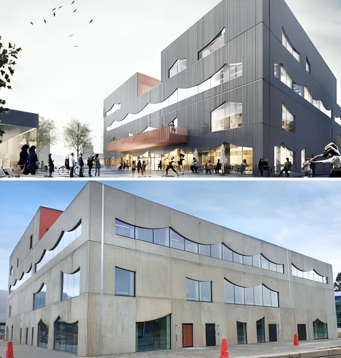
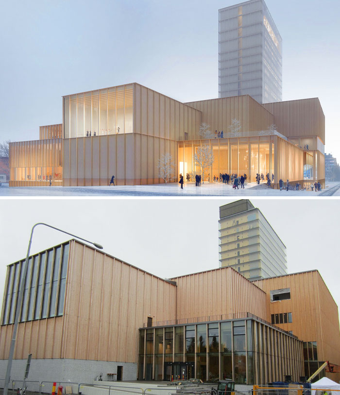
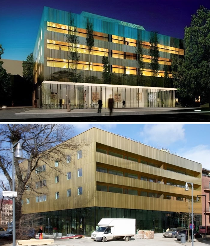
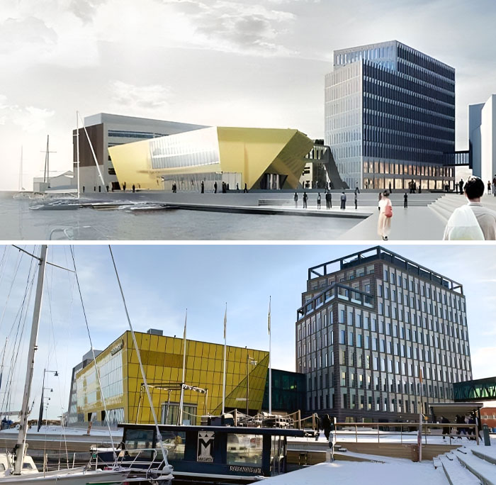
05. Växjö’s New Municipal Building. Render vs. Real Building
“There [are] scaleless worlds of splintered shards and riverine landscapes, in which forlorn mechanisms have been implanted like post-apocalyptic ruins of a distant future race,” Wainwright explained.
“Clouds of lines and layers were regularly employed as a smokescreen to disguise the fact that there wasn’t an idea at all: visual complexity masking conceptual thinness.”
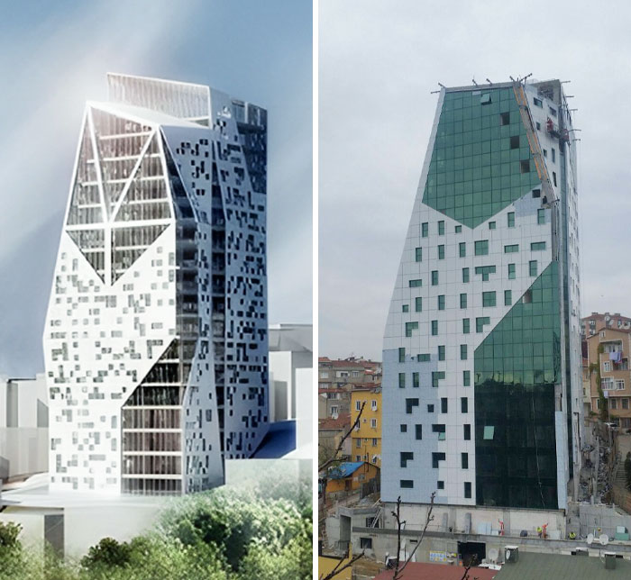
06. Residence Tree In Istanbul, Turkey
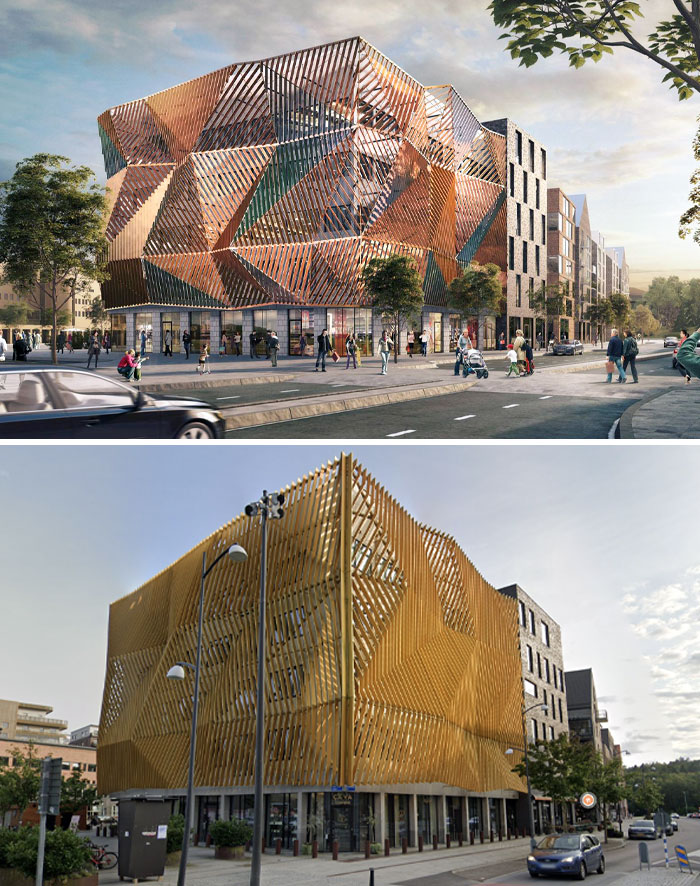
07. Located In Central Halmstad
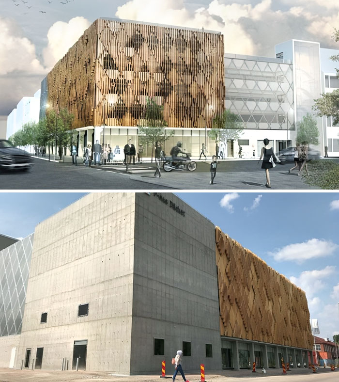
To sell projects, they brightened up the facades and exaggerated the number of pedestrians and cyclists in their render. They also invent greenery that doesn’t exist.
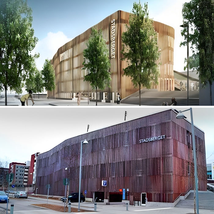
08. The So-Called Stadsberget In Piteå. Although It Is A Parking Garage, The Illustration Shows A Car-Free Environment With A Lot Of Cyclists And Pedestrians
Urbanist Vanessa Quirk agrees that many architecture schools have fallen into this trap in the UK and worldwide.
“It’s not just a symptom of the misguided nature of architecture education. It’s also symptomatic of architecture’s obsession with the image of architecture, an image completely detached from reality,” said Quirk, the interim president of the board at Urbanist Media, a non-profit trying to elevate underrepresented voices and preserve the places that matter to them.
09. Spektrum In Nya Hovas. Rendering Vs. Actual Result
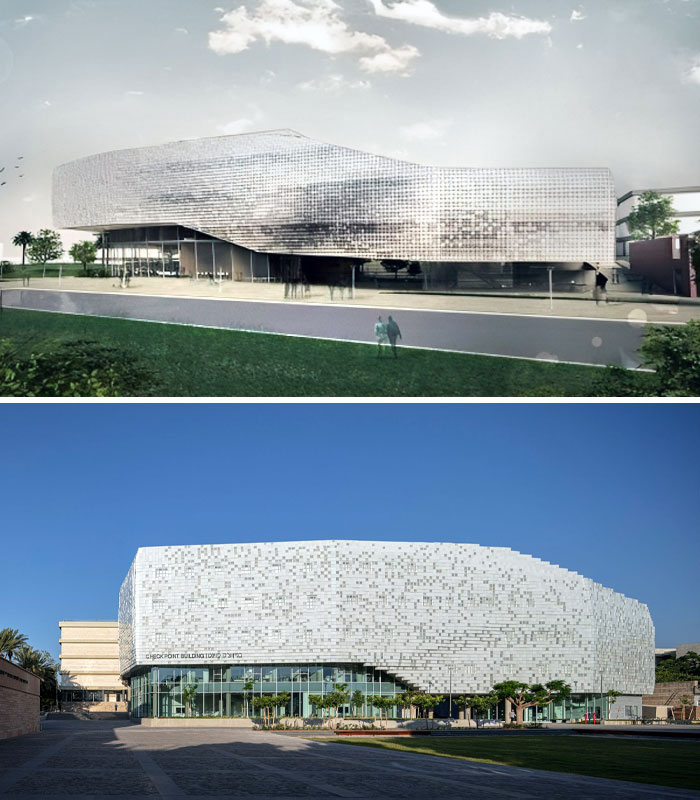
10. Tel Aviv University’s “Building Of The Future”
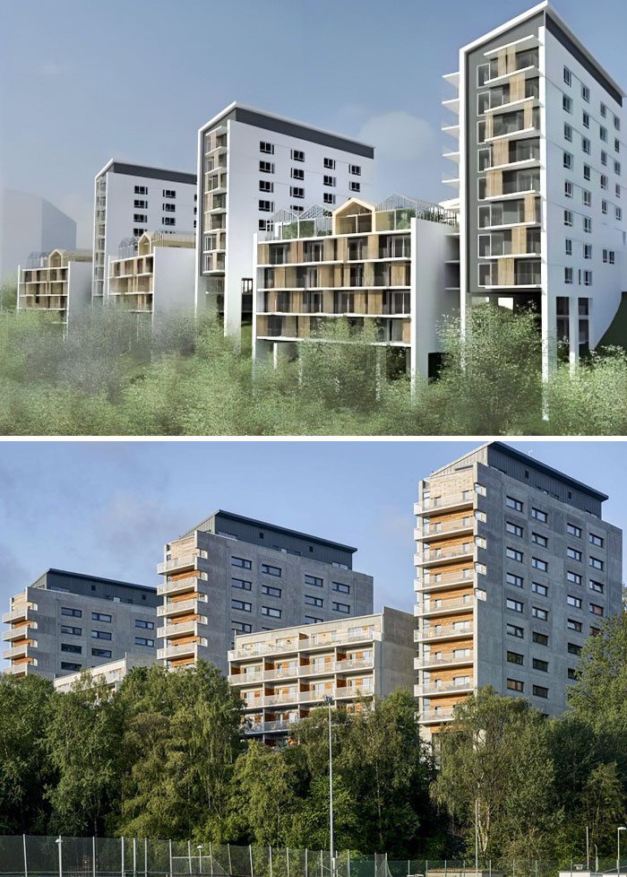
11. I Wonder How The People Who Bought Apartments In This Apocalyptic-Leninist Bunker Nightmare Feel About Their Investment
Quirk believes the idea of the “perfect” architectural image is not only propagated by professors who prioritize the rendering over its practical implications (causing students to spend hours perfecting visuals instead of perfecting the design).
In her eyes, the architectural media shares the blame. “[It] presents a flood of glossy shots that ‘sell’ an idealized architecture to the public and, frankly, architects themselves.”
12. Vision Vs. Reality. Platinan In Gothenburg, Sweden
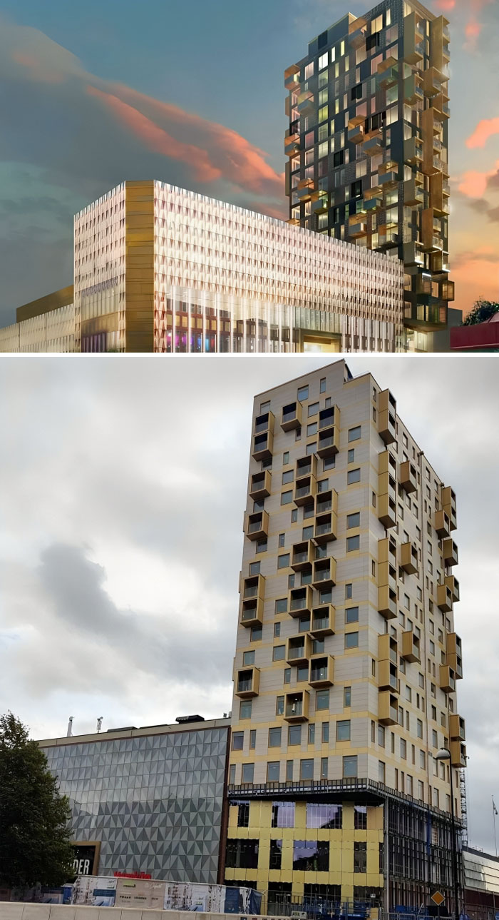
13. Söders Höjder In Helsingborg, Sweden
The actual building doesn’t shine much, and the reality is painful. Söders Höjder in Helsingborg is Sweden’s third ugliest new building in 2023 and also the building with the year’s worst fake view.
14. The Vision Of This Building Looked Great, But The Reality Is Very Disappointing
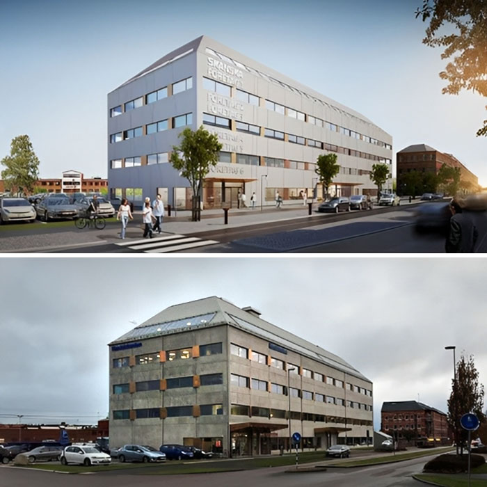
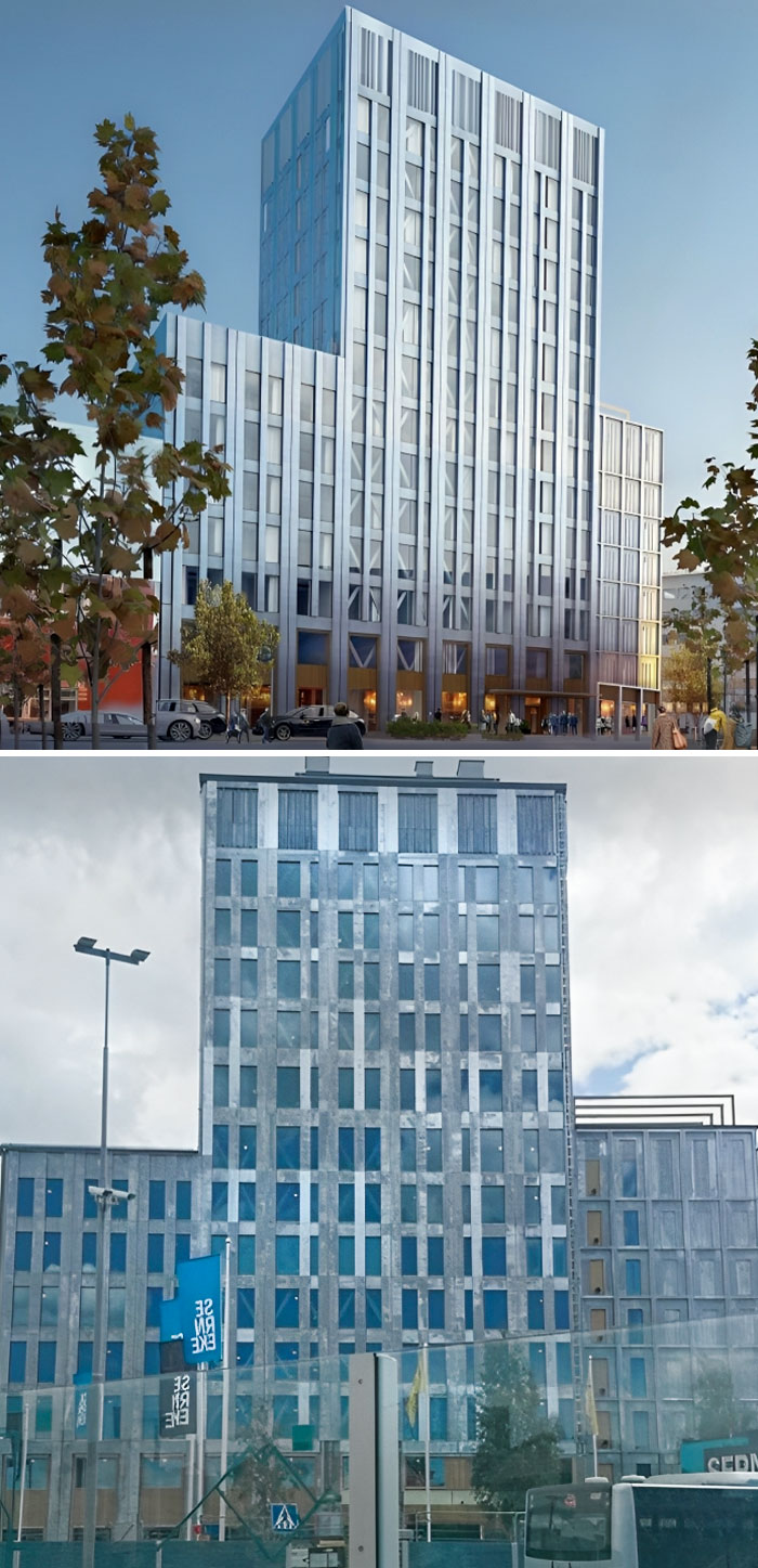
15. The New Hotel At Halmstad’s Travel Center. It Looks Like A Haunted Hotel
The danger of this is that the image exists independent of the concept, to be evaluated as a graphic, or as Quirk put it, “The architecture itself is erased, eclipsed by its image.”
The proliferation of such pictures could lead clients and the public to expect from architecture and architects a degree of quality and perfection that is impossible to deliver in the real world, which could result in disappointment.
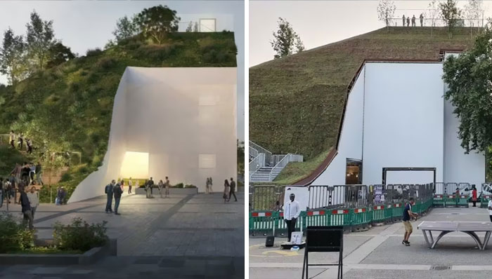
16. The Plans For The Marble Arch Mound On The Left Regarded Spectacular In Comparison With The Way It Had Been Constructed
17. This Monstrosity Of Selma Center In Gothenburg, Sweden
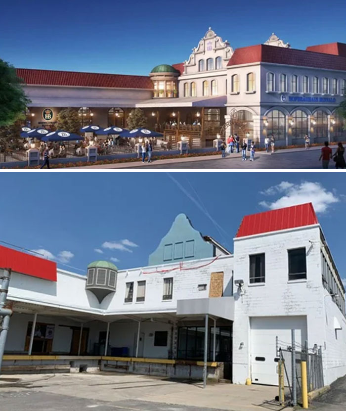
18. This Is A Building Concept For A Hofbräuhaus (German Beer Garden-Type Restaurant Chain) In Buffalo But Failed To Be Built Correctly Or Finished At All
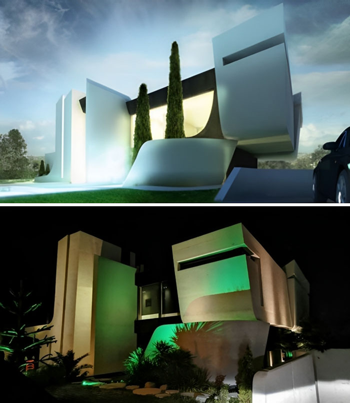
19. The Same, But Different: Architecture Expectations Vs. Disappointing Reality
Slightly idealized renderings are often seen as necessary means to sell a design idea to a client, in which case a bit of artistic leeway becomes an unavoidable evil.
However, as Quirk asked, once that idea is sold, “what happens when a more realistic rendering, one which shows as truthfully as possible how the building will look (air conditioning units and all), is presented?”
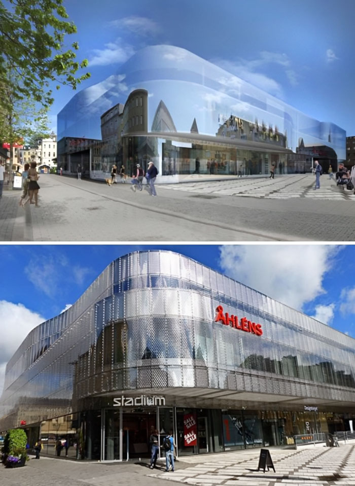
20. If You Can’t Design A Nice Building, You Can Always Try To Hide The Building Completely. Unfortunately, It’s More Difficult In Reality Than In The Picture
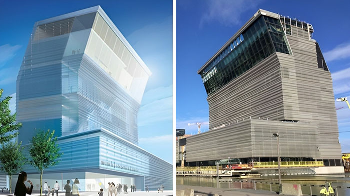
21. The New Munch Museum In Oslo Opened, And It Might Not Look Exactly Like The Vision Picture
22. Vågen Was Sweden’s Fifth Ugliest Building In 2022
23. A Different Angle, But The Message Is Still Clear – Horrendous
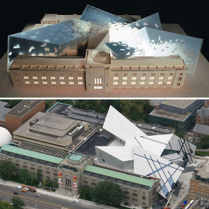
24. Royal Ontario Museum: Architecture Expectations Vs. Reality
When the rendering sets expectations far higher than anyone can achieve, does the realistic one become useless?
Is the stylized version of the rendering bad for architecture in general?
Should everyone stick to models and forget renderings altogether?
I guess time will tell.
25. Sara Cultural Center In Skellefteå, Sweden. In Reality, It Looks Very Sad
26. Glasiaren, Gothenburg. The Building Turned Into Something That Resembles An Old Refrigerator With Ugly Magnets
27. Totalitarian New Box In Kungsängen, Sweden. The Gray Color Looks Way Worse Than It Should Be
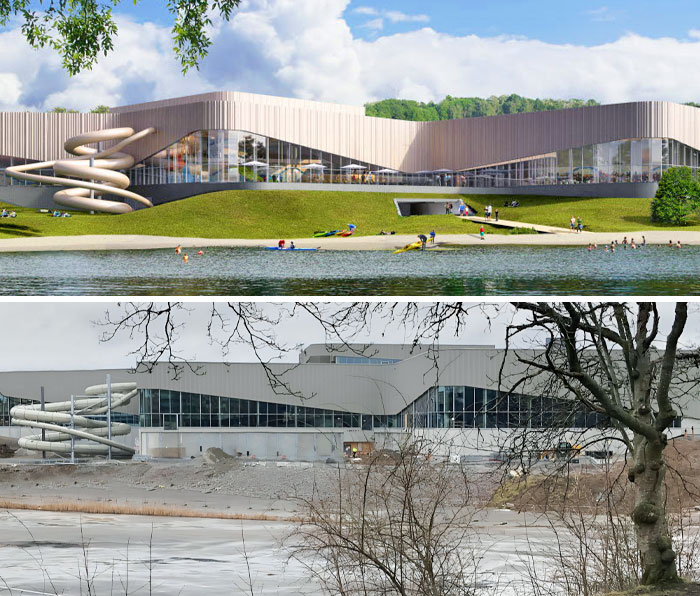
28. The Vision And Reality Of Kv. Poolen The New Bathhouse In Frösunda, Sweden
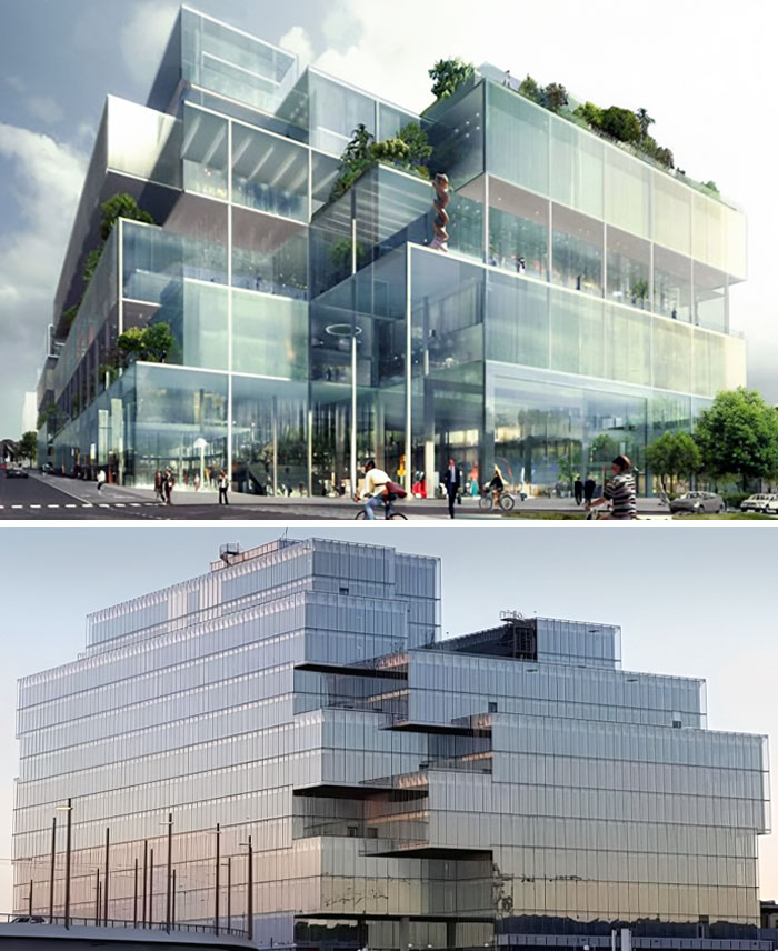
29. Malmö’s New District Court In Sweden. Vision vs. Reality
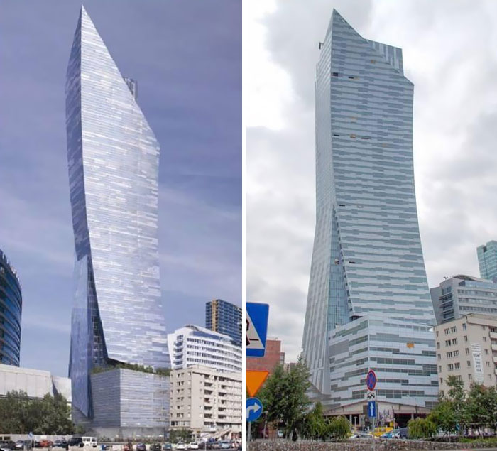
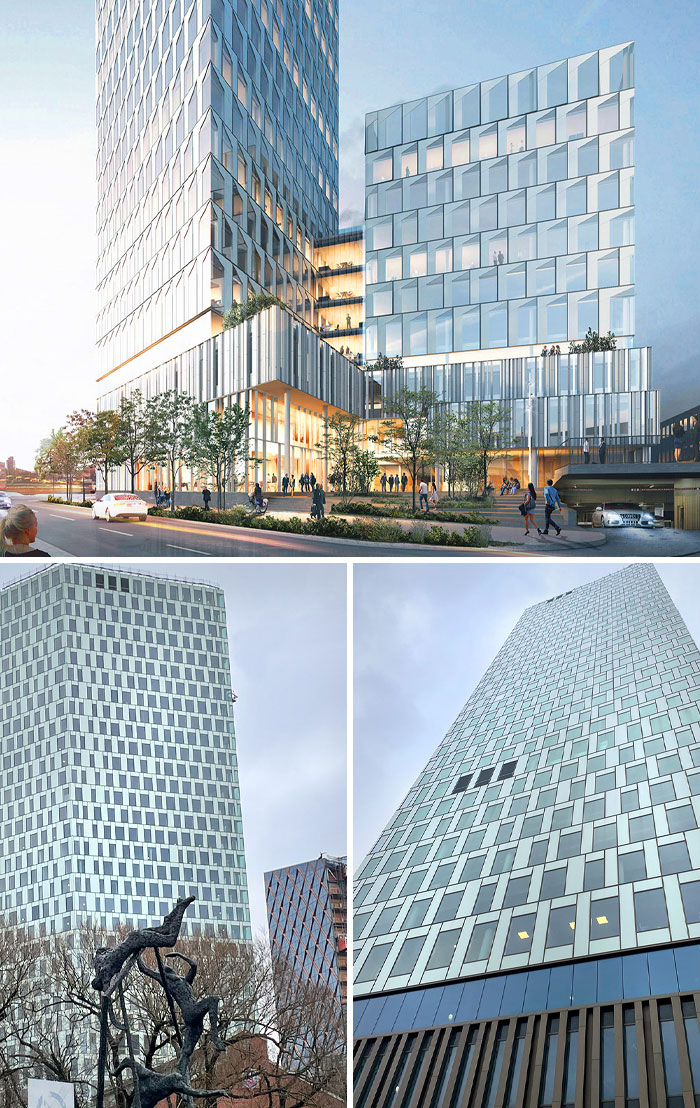
30. A Skyscraper In Warsaw, Poland
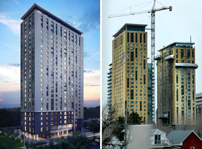
31. It’s Funny How Buildings Change Color
32. Sven-Harry’s Art Museum In Vasaparken, Stockholm
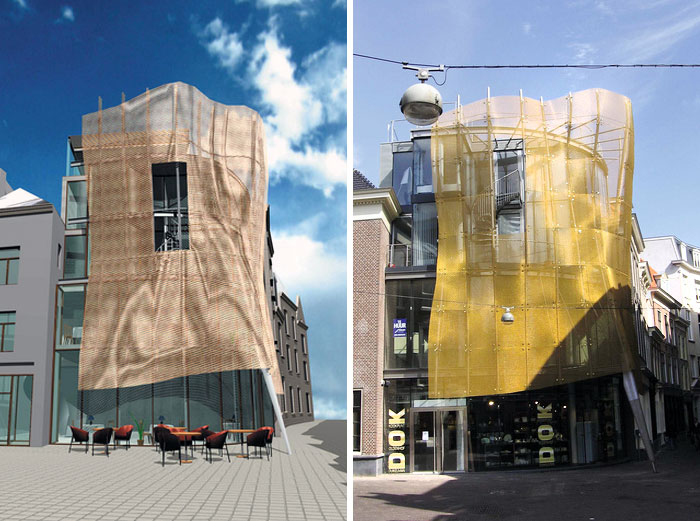
33. “Bal Gown” In The Hague, Netherlands. It Had The Potential
34. The Render Of Däcket Car Park And The Reality Of It
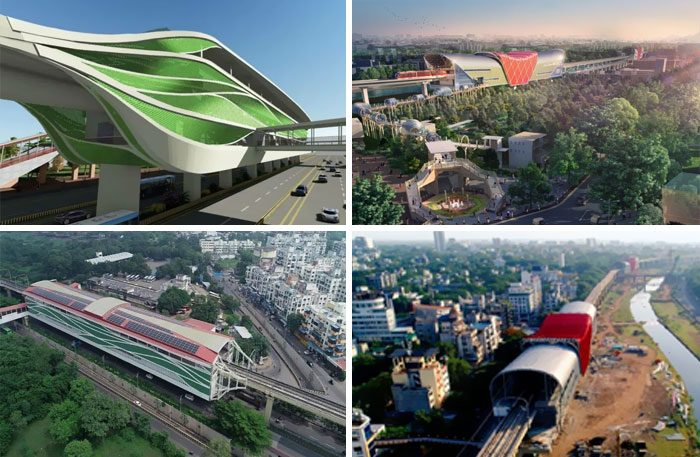
35. Planned Vs. Actual Pune Metro. Left – Sant Tukaram Metro Station, PCMC. Right – Deccan Gymkhana, Pune
36. Citygate (Getingboet) In Gothenburg, Sweden. Those Windows Look Different
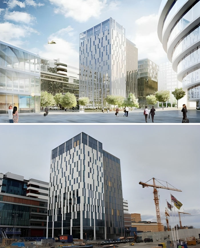
37. The Elite Hotel Carolina Tower At Nya Karolinska In Hagastaden, Stockholm, Sweden
According to the vision, the place would suddenly become much brighter when the hotel will be completed. Unfortunately, they were wrong.
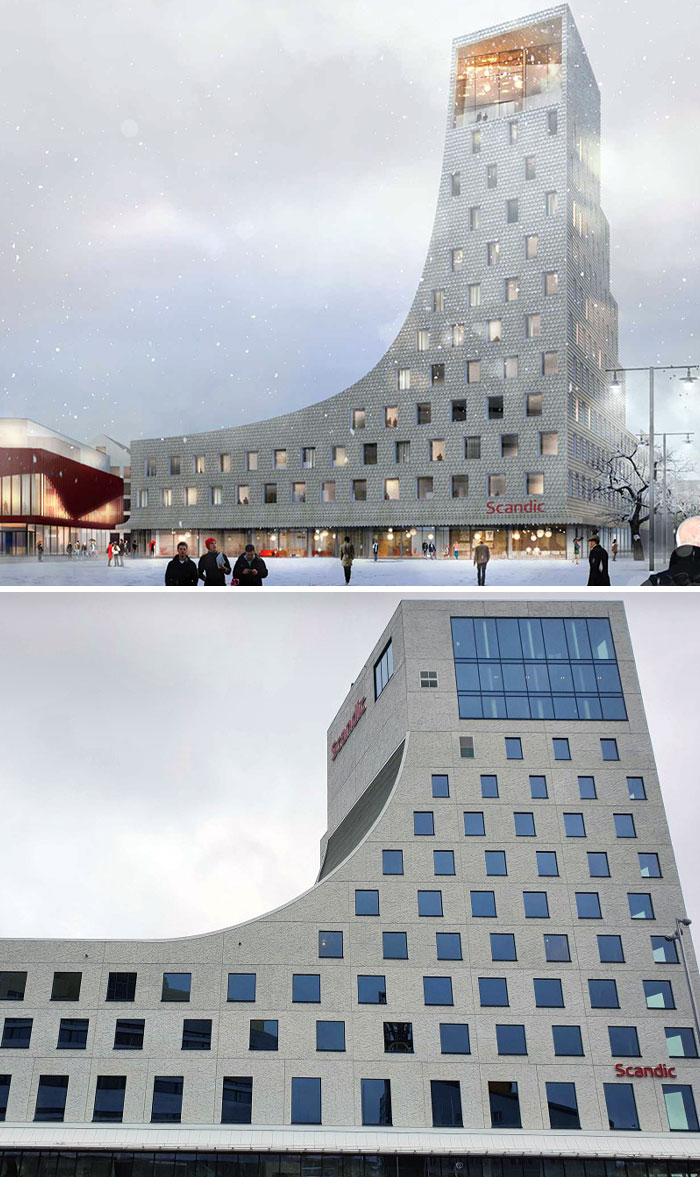
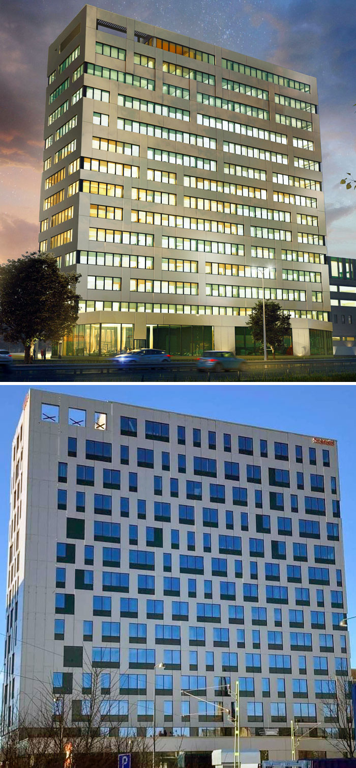
38. The Render One Looked Way Better. Scandic Central In Örebro, Sweden
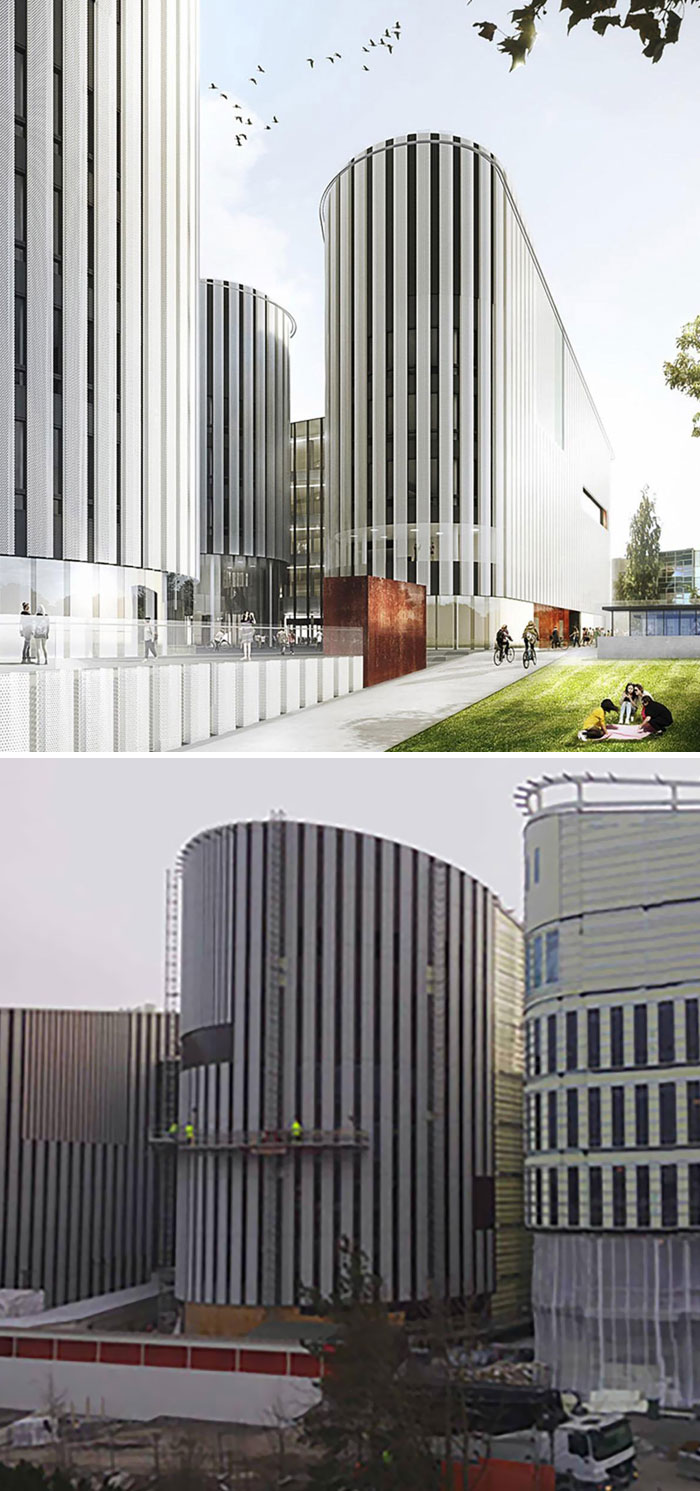
39. An Expectation Image Of Metropolia’s Myllypuro Campus Vs. An Image From Reality
40. Kalmar House Stella In Sweden. At Least They Tried.
41. A New Landmark Was Built In Kallhäll, Stockholm
The result angered the residents who had expected a white house. Those responsible replied that they saw no problem with the illustrations: “We have done what we said we would do. Not everyone can love a house.”
42. From Architecture Expectations To Reality
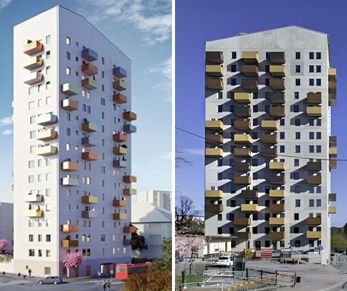
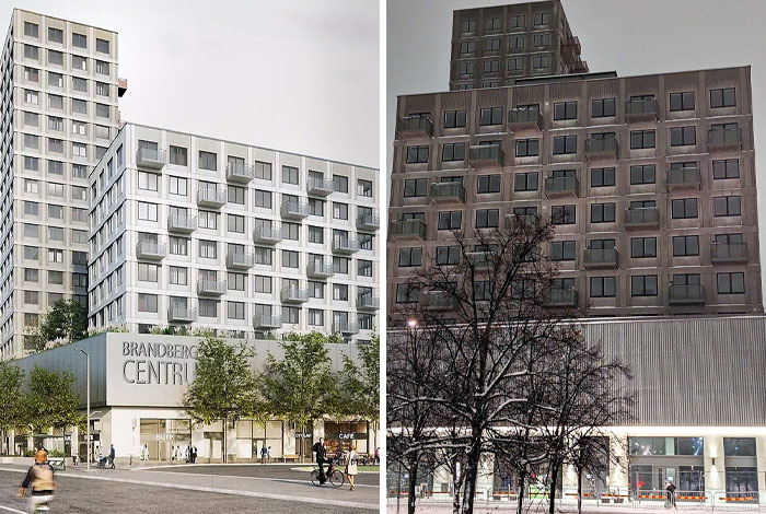
43. Vision Picture For Brandbergen Centre. It Didn’t Turn Out Exactly As Planned
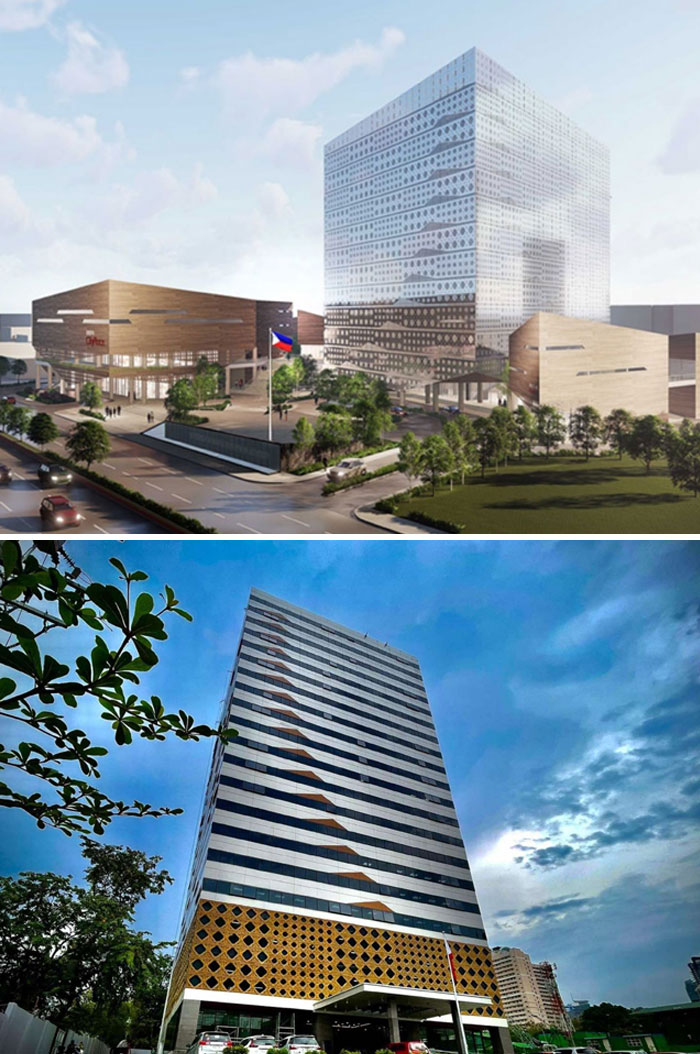
44. Metropolitan Manila Development Authority Headquarters: Architecture Expectations Vs. Reality
45. Reality Is Bleak Compared To The Rendering World
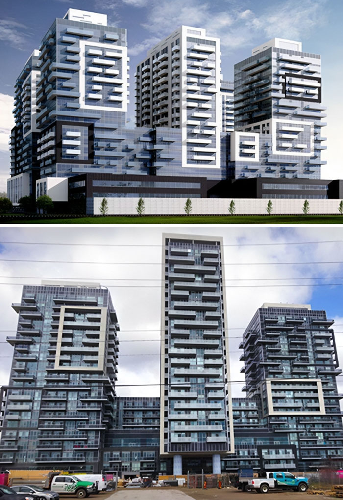
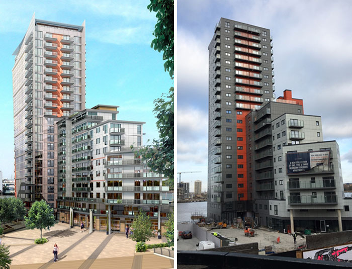
46. The Completed Mast Quay Phase II Built-To-Rent Development Is Substantially Different From The Scheme That Was Originally Permitted
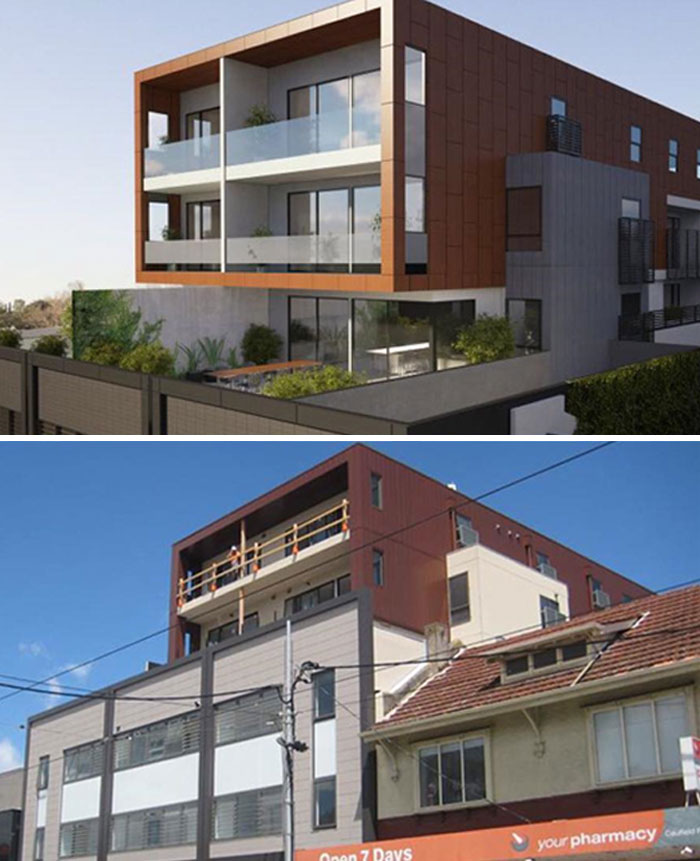
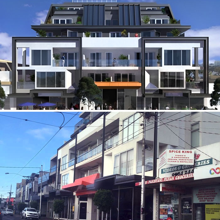
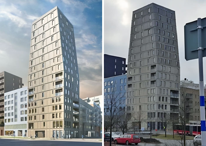
47. An Apartment Building Near Stockholm: Architecture Expectations Vs. Disappointing Reality
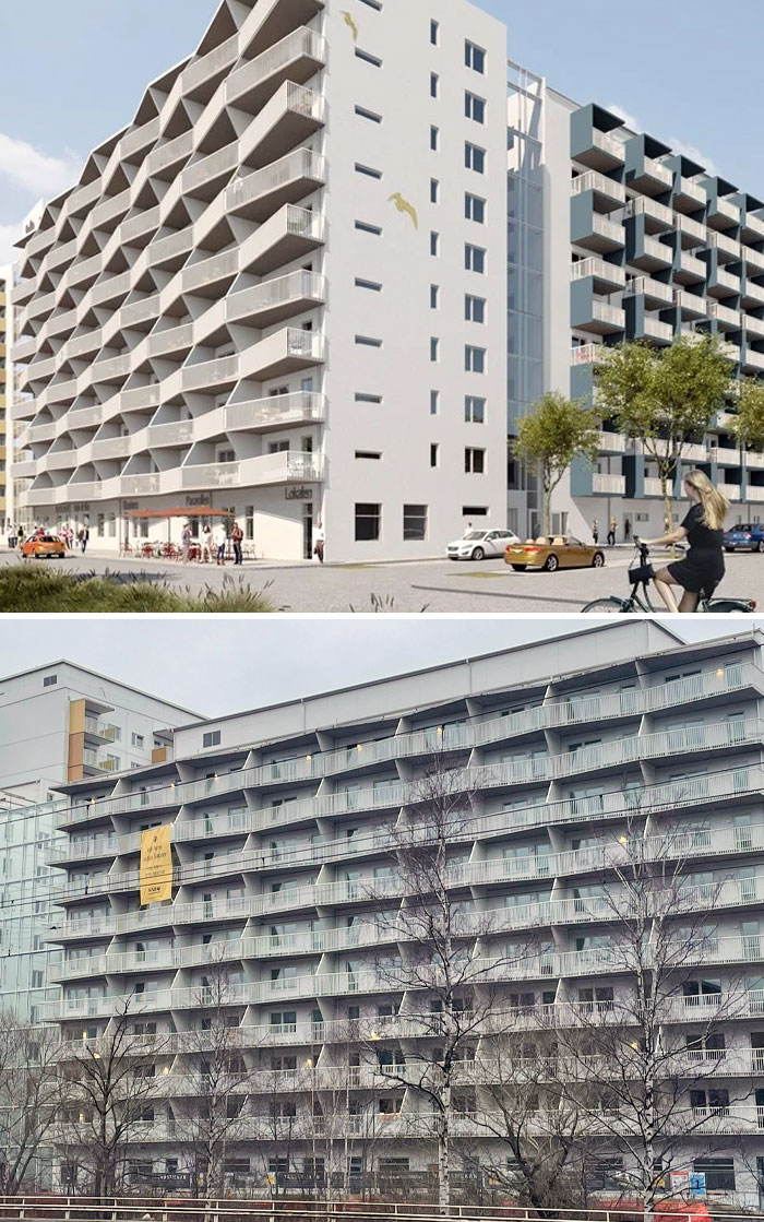
48. This Disappointing Building In Gothenburg, Sweden
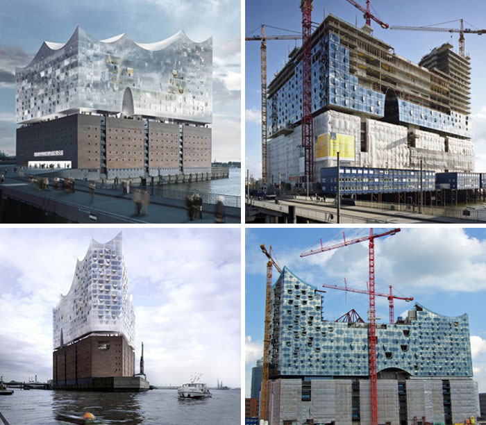
49. Elbe Philharmonic Hall. In The Renders Of This Project, Hinged Glass Facade Resembles A Perfect Blanket, Almost Weightless. However, In Reality, The Facade Does Not Show The Same Effect
50. In The Renderings, There Are Significantly More People Than Cars On The Roads, But In Reality It Is The Opposite
Like what you’re reading? Subscribe to our top stories.














Discussion about this post