First Crescent is a stunning seven-bedroom rental villa in Campus Bay, South Africa, designed by SAOTA – Stefan Antoni Olmesdahl Truen Architects, a Cape Town-based studio.
First Crescent In South Africa By SAOTA:
Exterior Description:
The owner’s brief was to design a dramatic, memorable house. The house needed to suit his aesthetic considerations and be flexible enough to be either partially or entirely rented out. The client has a discerning eye for striking contemporary design. The fantastic position of the site lent itself to creating an elegant response.
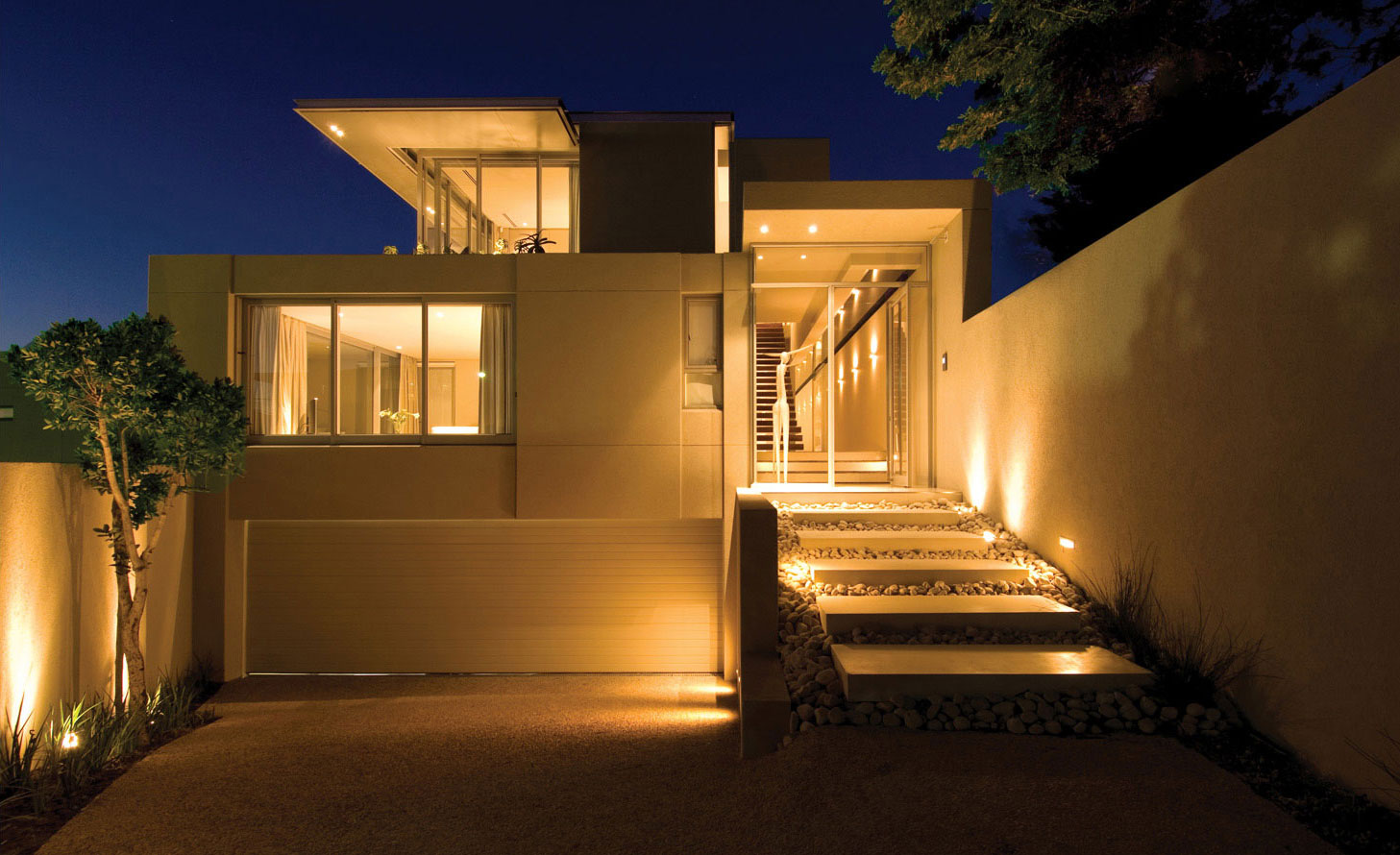
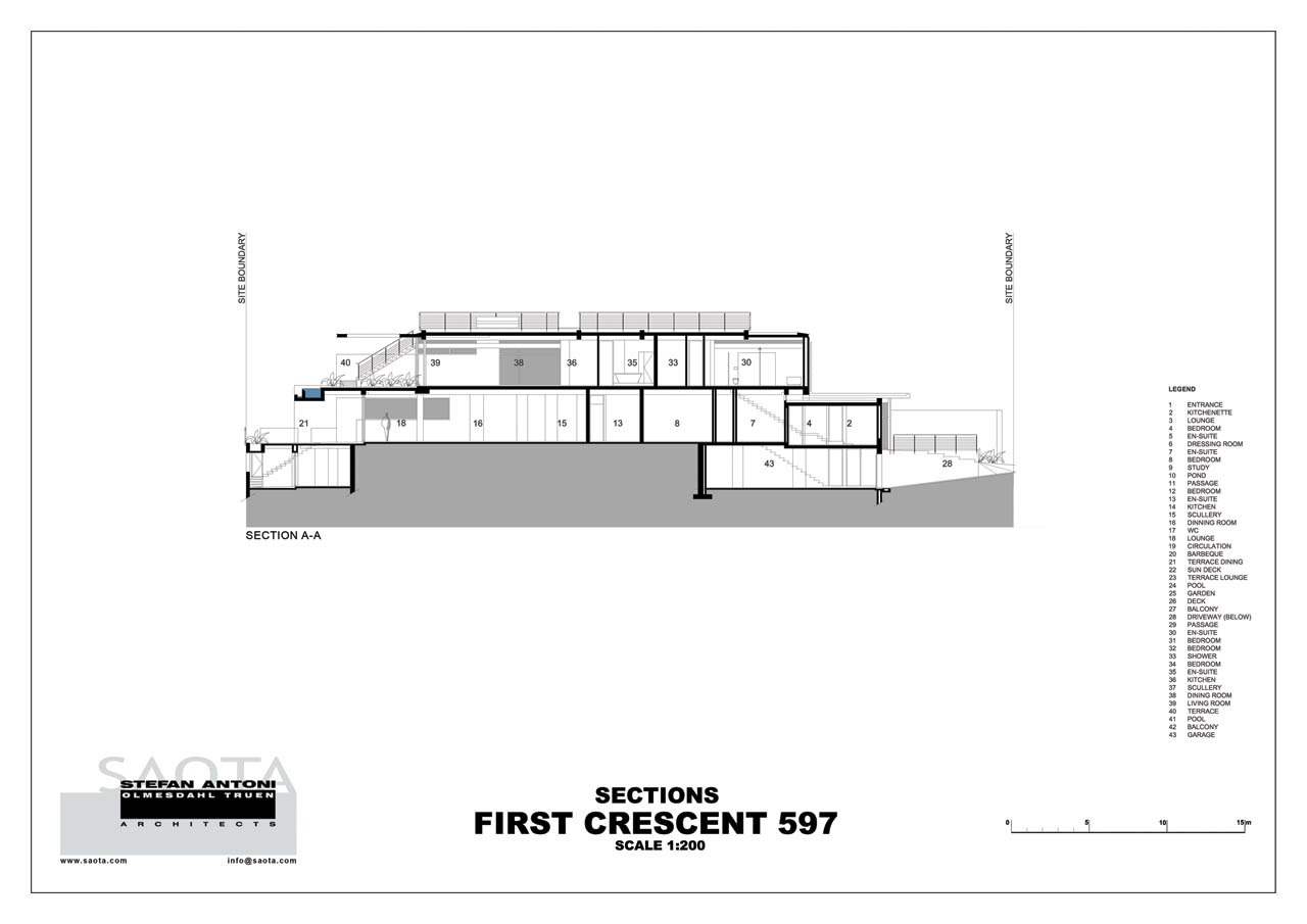
First Crescent had a double-story house located centrally on the site, which was cut in half and resulted in a substantial south-facing front garden. However, the existing house did not maximize the site’s potential, so the team entirely demolished it, except for the small basement area. They converted the basement into a guest suite with exceptional views. The team faced difficulties due to the site’s shape, which is 50m long and only 20m wide. Despite the challenges, they responded with striking solid lines. They found ways to accommodate all the rooms without creating a dull layout. Additionally, the team dealt with the extensive fill above the natural ground level.
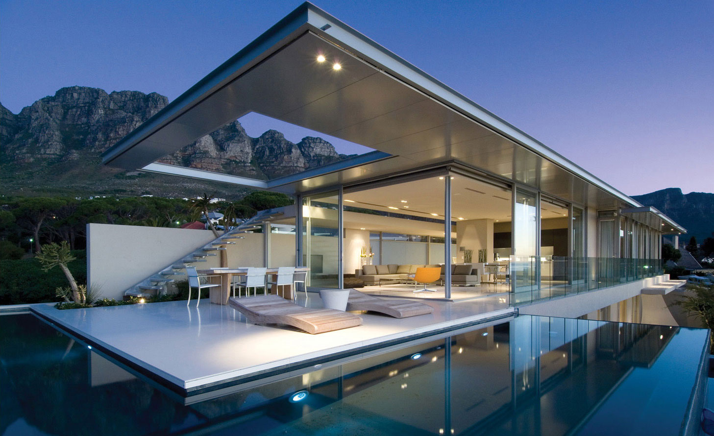
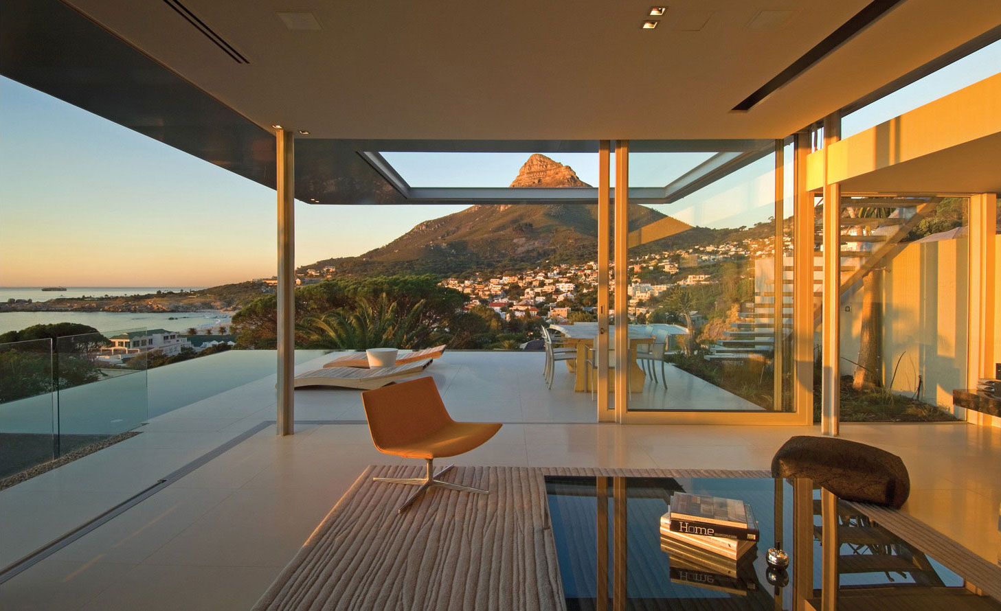
The property, and subsequently the plan of the house, focused on Camps Bay beach and the views of Lion’s Head in a Northerly direction. There are also great views of The Twelve Apostles and the Cable Station. The design also needed to respond to privacy issues with the neighbor’s property to capitalize on the views. Clerestory frameless glazing (skylights) replaced structure and framed views that might have been missed. Sandblasting of the full-height glazing at the eastern boundary enabled us to maximize light to the linear passage and maintain views of the mountain peaks while adhering to council requirements and ensuring the privacy of the neighboring property.
Interior Description:
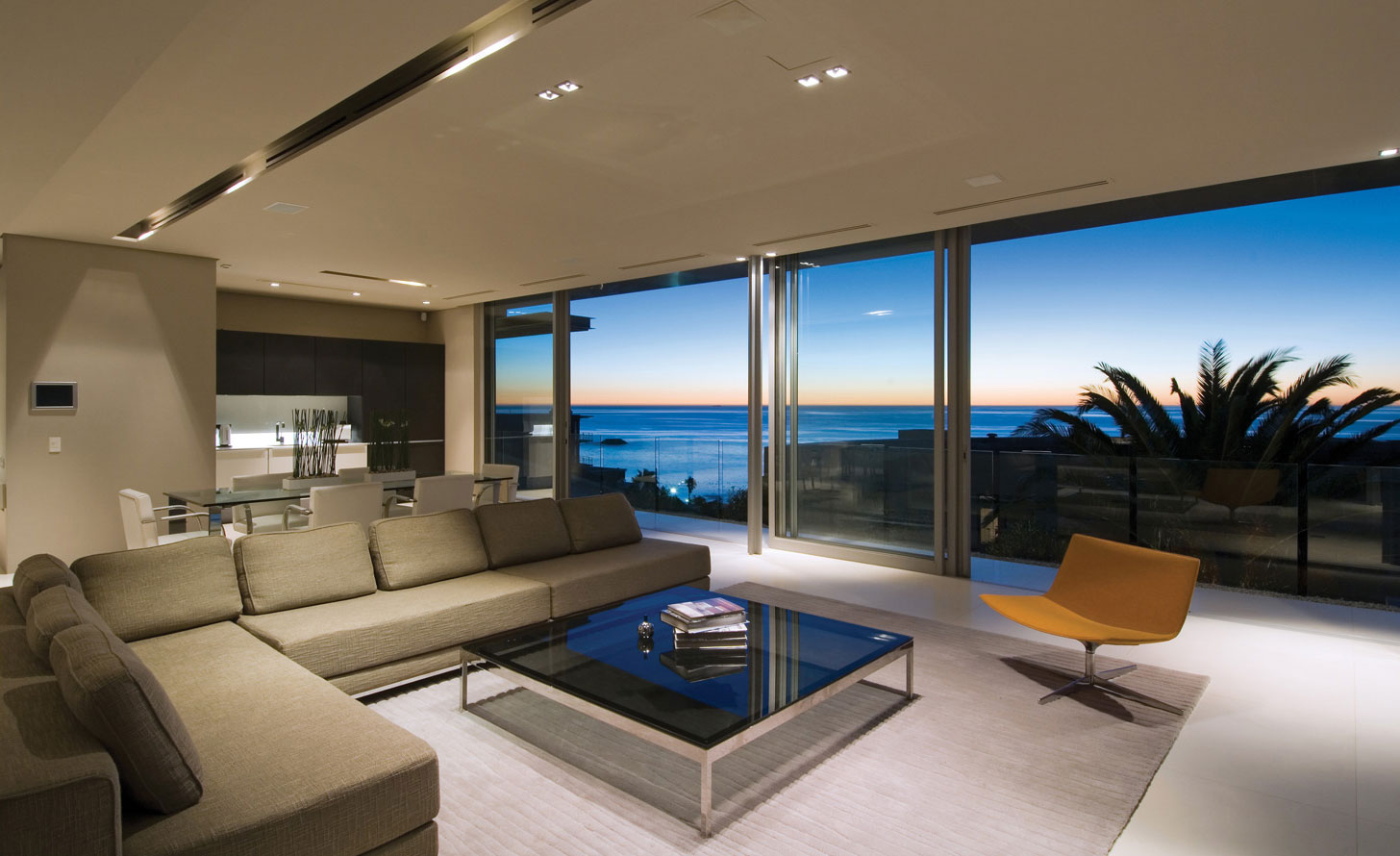
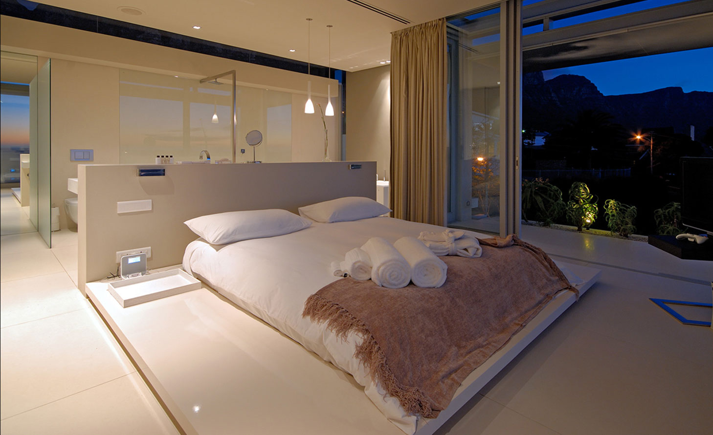
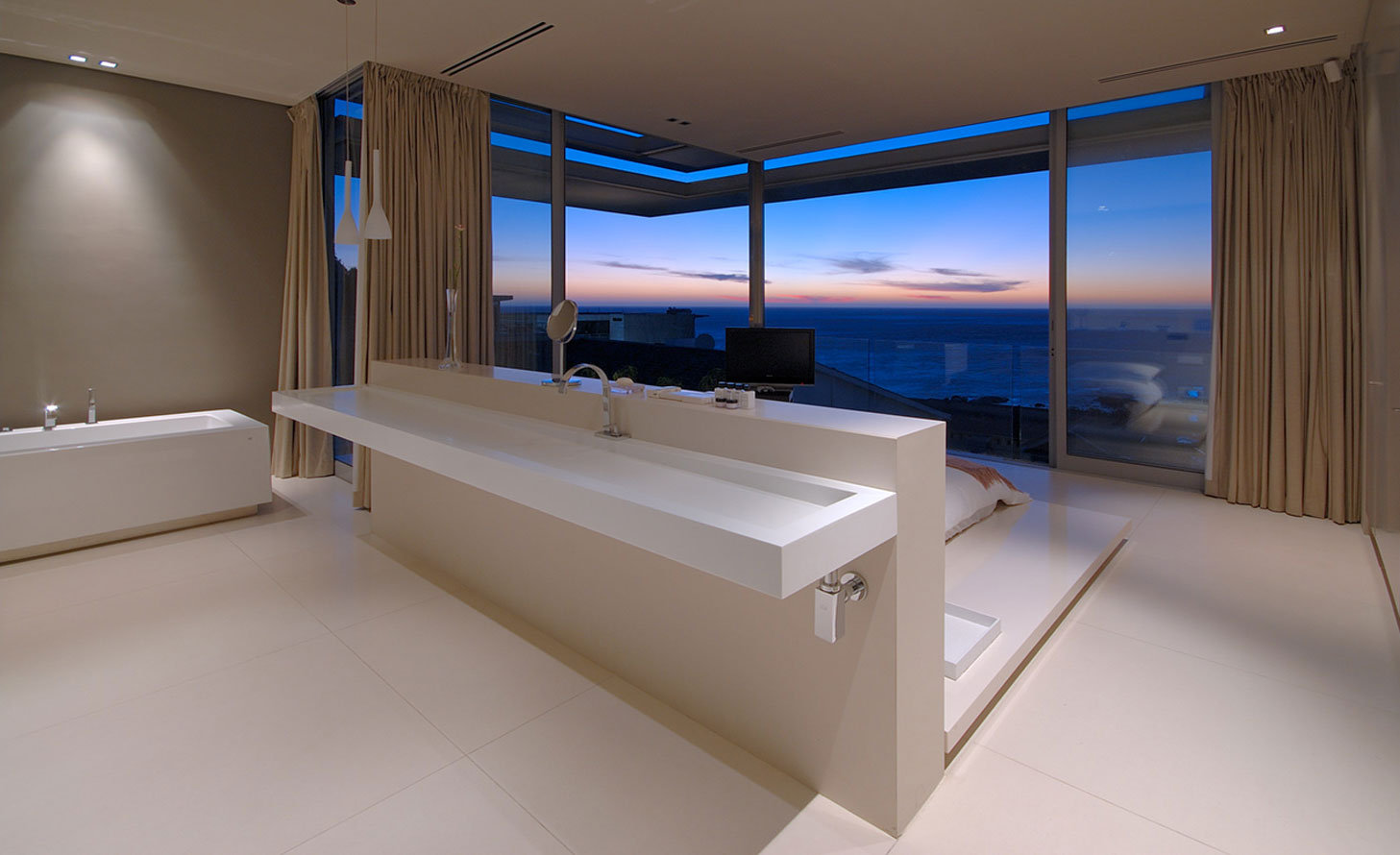
The fantastic sea views were the main focus as the bedrooms faced towards the west. The linear circulation space, which forms the rear ‘spine’ of the house, offered a dramatic staircase with excellent views of the Cable Station.
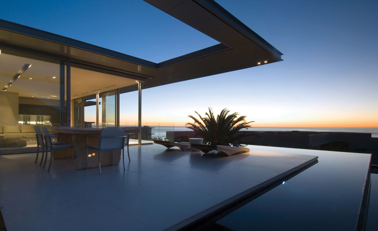
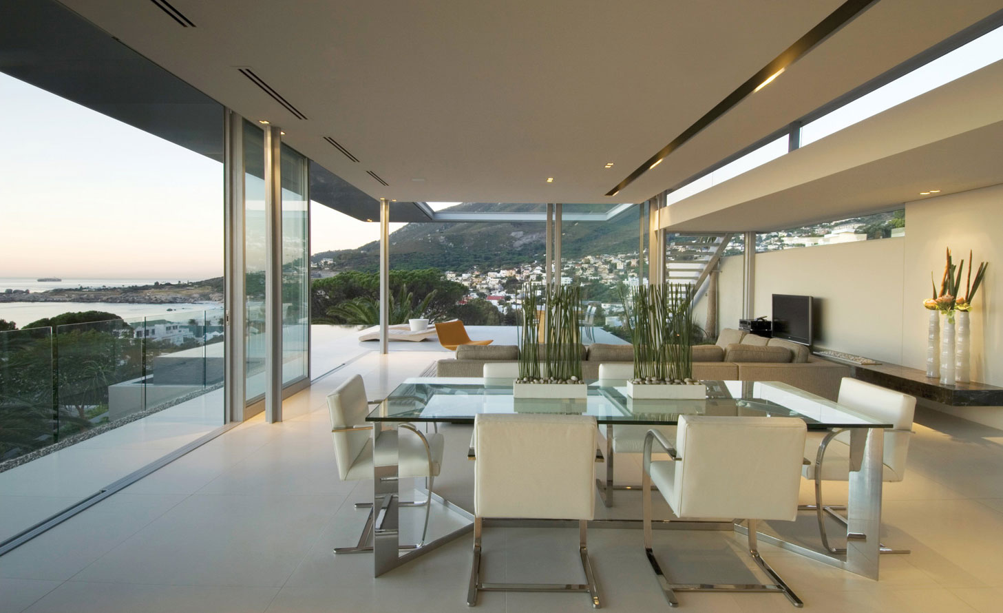
All the living spaces are on the house’s northern side, and it feels like they are propelling themselves toward the view. All living spaces connect powerfully to the covered or uncovered terraces, and the continuation of the interior/exterior space is dramatic. The living spaces are highly transparent so you can take full advantage of the views.
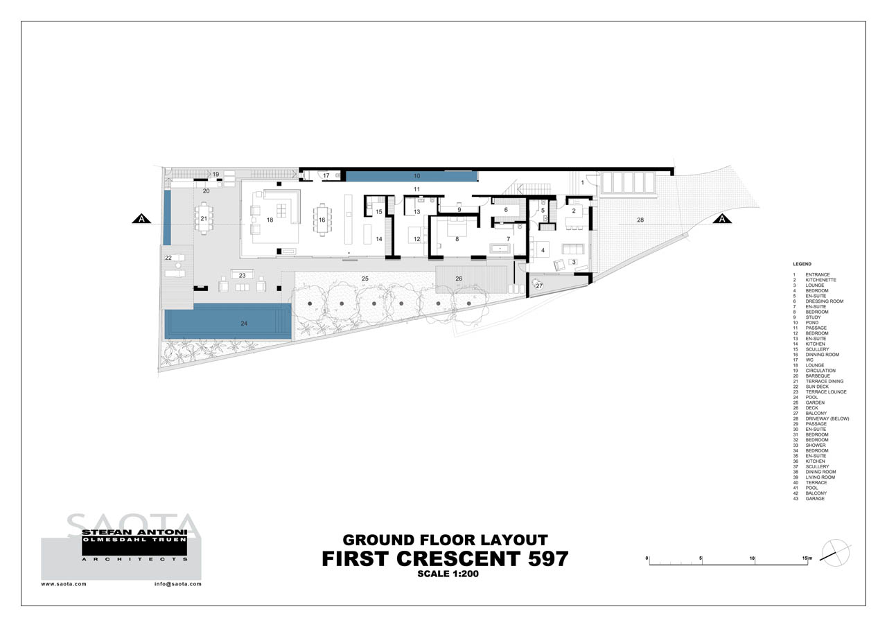
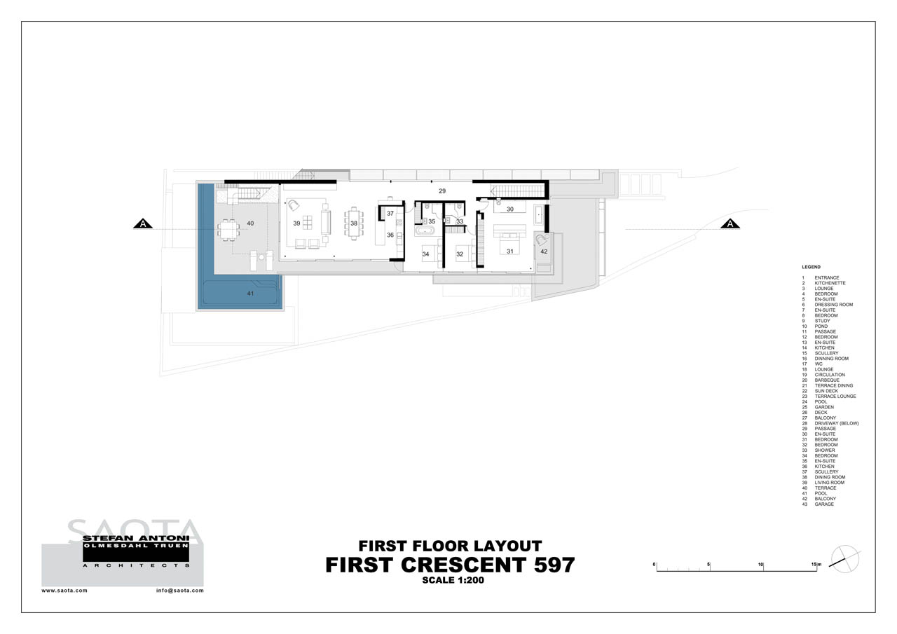
The Upstairs and Downstairs levels offer full amenities and are self-sufficient living spaces. However, the ground floor has a self-contained staff suite. Two bedrooms and a water feature that runs the entire passage length emphasize the house’s linearity. The terrace on this level mainly provides views restricted to the North. On the other hand, the First Floor, elevated above the neighboring houses, offers a 360-degree view that can be enjoyed.
The roof over the deck has a steel structure that cantilevers out of the reinforced concrete of the roof slab. A steel ‘ring’ beam was used to create the cut-out, and the roof’s remaining external extent was clad with aluminum panels. Steel sections remain visible, creating the illusion of a fragile roof. Reinforced concrete upstand beams are, however, set back from the edge of the roof edge and are not visible from below.
Architects: SAOTA: SAOTA (Stefan Antoni Olmesdahl Truen Architects) – Stefan Antoni, Philip Olmesdahl, Tamaryn Hammond
Area: 676 m²
Year: 2007
Like what you’re reading? Subscribe to our top stories.










Discussion about this post