Some buildings will fascinate you with their stunning designs, genius architectural decisions, and the sheer power of their aesthetics. However, this article is about lousy architecture examples, not these kinds of buildings. Nope! Not all buildings are made equal, and the ‘bad’ ones need to be shamed publicly so that others don’t copy their designs. So we’ll be focusing exclusively on just plain terrible architectural decisions.
And the worst end up on the ‘That’s It, I’m Architecture Shaming’ Facebook group, where users mercilessly prod and poke lousy design. Scrolling through during your next coffee break is fun, educational, and relaxed.
Remember to upvote your favorite photos you love to hate and follow the architecture-shaming Facebook group if you like their stuff. They’re a growing community with excellent content.
We spoke about what separates good and bad design, the need to democratize access to quirky private property designs, and the roles that architecture plays with an expert from Sweden with a background in urban planning. You’ll find our full interview with her below.
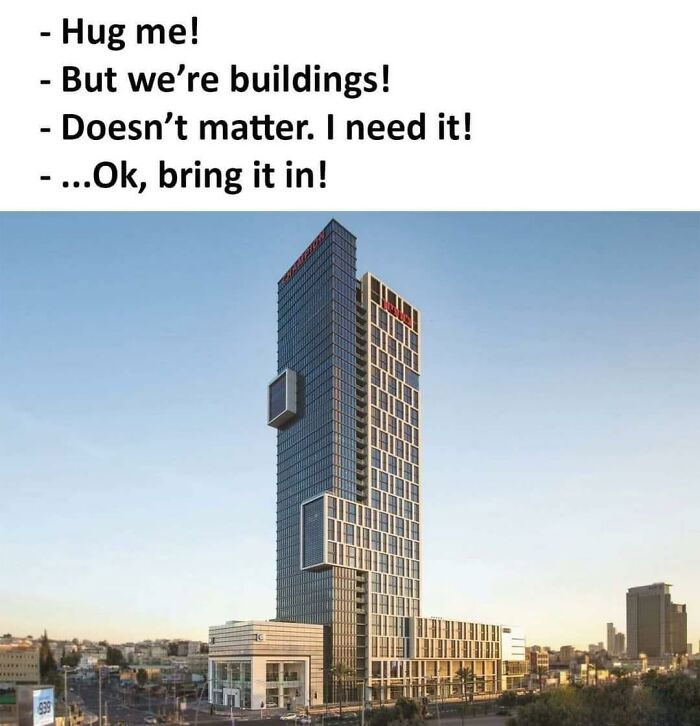
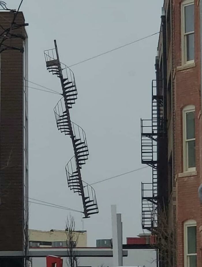
01. I Dunno; Slim Doesn’t Seem To Be Digging This Situation
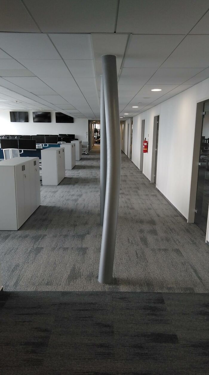
02. This Pillar Was Straight Last Week. This Is The First Floor Of A Seven-Floor Building
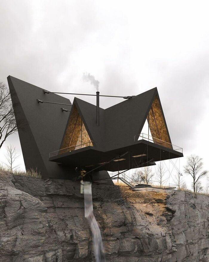
03. I Do Not Give A Damn How Well It’s Cantilevered Or How Strong The Struts Are. I Do Not Have The Kind Of Luck It Would Take To Set Foot In This House
The Sweden-based urban planning expert explained that while public spaces must meet safety and accessibility standards, aesthetic standards can be much more fluid for buildings. The expert spoke to us on the condition that she remain anonymous. (Remember, just because you’re an expert in something and want to be helpful doesn’t mean that you always like the limelight… unlike quirky architecture, which begs you to look at it!)
“Most of the time, the elements of the built environment should be in harmony amidst each other and with the surroundings. However, sometimes, something bolder and out-of-the-box might form an engaging contrast,” she said. However, the urban planning expert shared with A&D that, in her opinion, our built environments have to engage us and stimulate our minds and senses. She believes architecture’s ability to make us think is one of its most potent aspects.
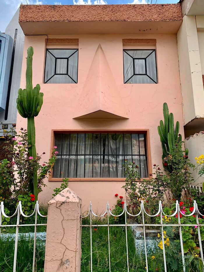
04. The Cactus Is *Chef’s Kiss
05. This Is Not Photoshopped
06. That Gives Me Anxiety – Bad Architecture Examples
“There are circumstances where the architecture should create a sense of calmness and safety, yet there are instances in which it is not bad if the architecture provokes us and makes us think, ‘Why don’t I like the look of this building?'”
The urban planner said we should allow people to express themselves as they wish when designing their private property. She believes nearly everything is allowed as long as they have the means.
07. Opera And Ballet Theatre Of Cheboksary (Russia)
Top: original picture
Bottom: slightly photoshopped picture
08. A Friend Of Mine Cross-Posted This, And It Made Me Think Of Y’all
09. I Might Like This If Those Were Slides
“Quirky architecture comes from our innate desire to demonstrate our uniqueness. However, not everyone with the means has an average taste for aesthetics. Yet, as long as it is for the people who inhabit or use their private space, I mean, why not?” she told us that as long as you’re not actively harming anyone else with how bad your designs are, you should be able to be as unique as you want even if it falls short of objective aesthetic standards.
10. Who Remembers Those Gerbil Enclosures That Look Like This?
11. This Looks Like A Place A Villain Would Live
12. I’ll Meet Your Brutalism, And Raise You This
However, the expert acknowledged that others in the industry might not see things like hers. She said others believe private property must be in harmony with the surroundings.
“But, we should not cross that thin line where architecture becomes reserved for only the wealthy and for those with ‘good taste’ (whoever decides that). I’m only talking about private property here, though. When it comes to public space, there should be a consensus between the public and the professional about the design,” she said that the rules for the private and public spheres are very different.
13. Um… What Is This?
14. Art Nouveau On Psychedelics
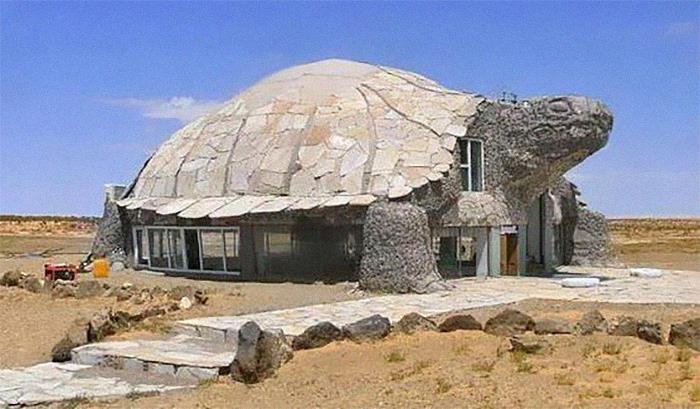
15. I Wonder Who Thought This Would Be A Good Idea
The urban planning expert also had some advice when it comes to design. “Firstly, even though I often advocate for unconventionally looking buildings, I do not encourage purposefully provocative architecture. The building should be designed to accommodate and protect society. It should create a sense of safety but not be boring,” she told A&D that we ought to strike a balance between uniqueness and service, expression, and community.
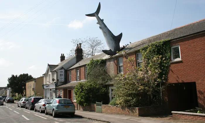
16. “Sharkitecture” – Bad Architecture Examples
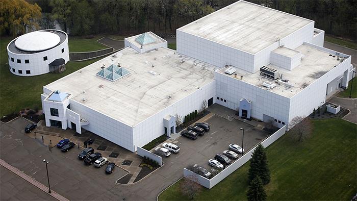
17. Can We All Take A Moment And Acknowledge That Prince Produced Some Great Music, But He Lived In A Water Treatment Station
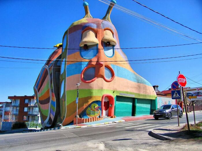
18. The “Snail House” In Bulgaria Does Look Like A Snail
Moreover, the expert from Sweden pointed out that accessibility, inclusiveness, and empowerment should also be critical features of any architectural project. “Also, I prefer somewhat complex but systemic designs. Minimalistic and box-like floor plans are good in some cases where easy access is necessary (for example, hospitals), yet they can be completely mind-numbing. In contrast, more complex floor plan designs are more mind-stimulating (for example, good for schools, in my opinion).”
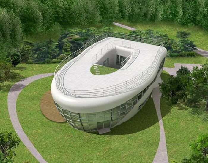
19. Toilet-Shaped House (Named Haewoojae), Built By Sim Jae-Duck, The Chairman Of The Organizing Committee Of The Inaugural General Assembly Of The World Toilet Association
20. Interesting Concept
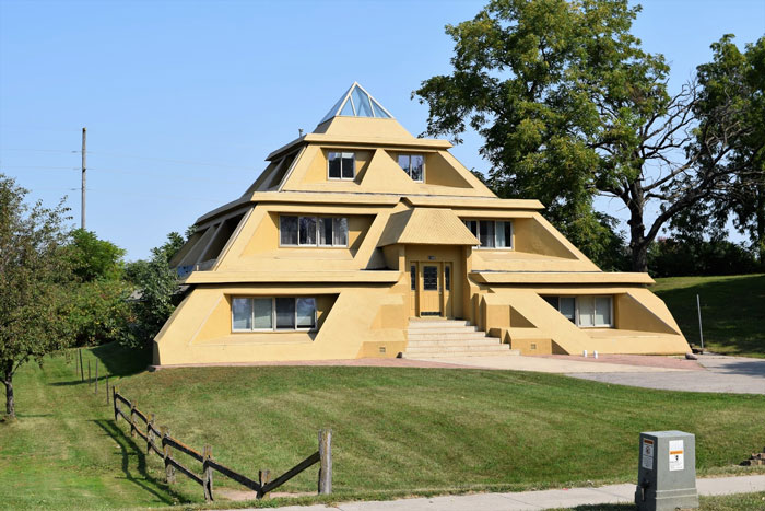
21. A House I Used To Drive Past In A Little Iowa Town. All I Ever Heard From Locals Was That This Place Had A Terrible Leaking Problem When It Rained
The ‘That’s It; I’m Architecture Shaming’ community had 64.1k members when writing. However, it’s increasing that by the time you’re reading this, dear A&D followers, that number could be much higher. The group grew by over 7.3k members in the last week alone. And they’ve made upwards of a thousand posts in the last month.
22. They Drew The Line At A Fountain In The Kitchen
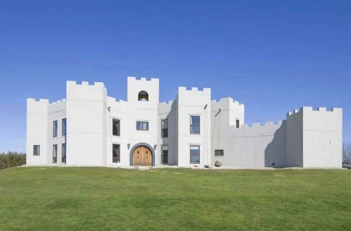
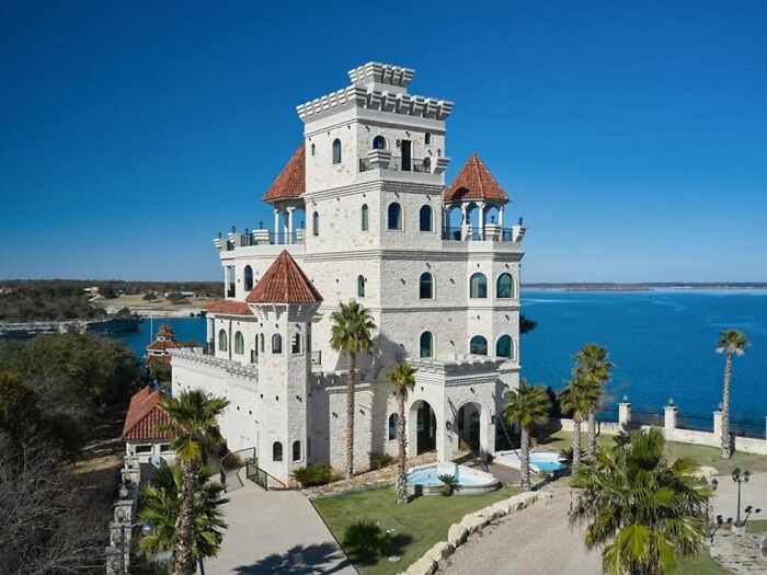
23. You, Too, Can Have Your Own White Castle
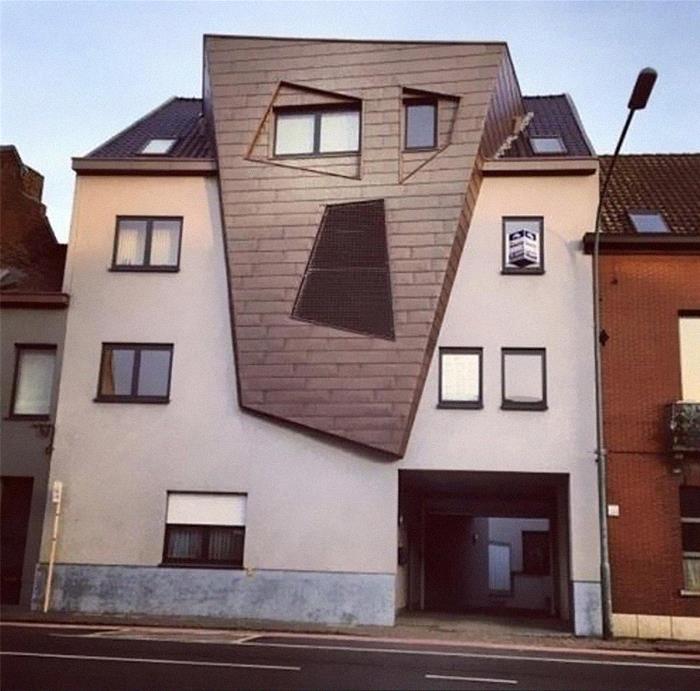
24. I Will Haunt Your Dreams! Residential Building In Belgium
Because of this fast growth and the issues that came with it, the administrator of the ‘Architecture Shaming group, Oregon-based Matthew Brühn, addressed the community and the changes that took place in April. In short, the rules are much more structured now.
25. I Think Syndrome From The Incredibles Lived Here
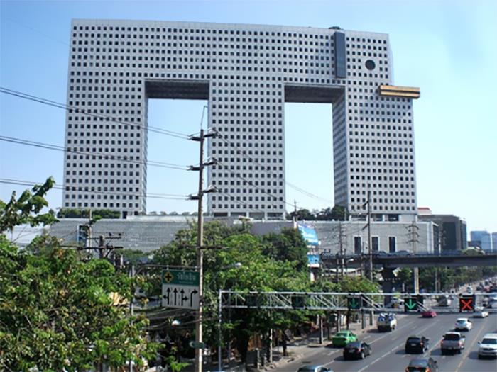
26. Bangkok’s Elephant Building. The Tusks Are A Bowling Alley In My Imagination
27. Why?
Matthew pointed out that the admins have been tired of the “massive influx of negativity” that came with more and more members joining the community. While the admin expressed his admiration for how wonderful many members are, he also noted that the group will start filtering out overly-aggressive posts.
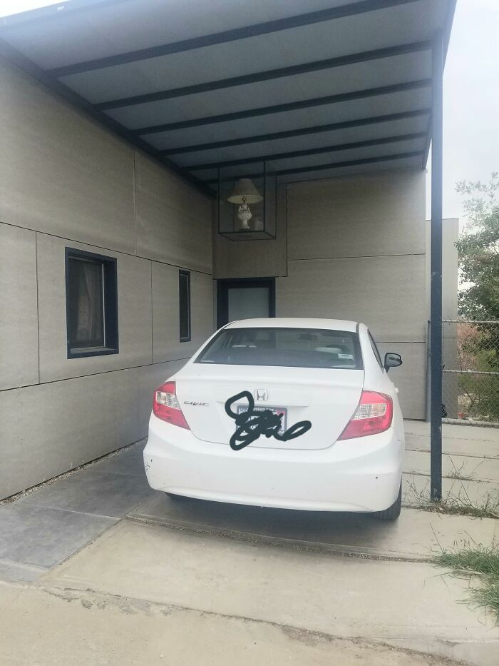
28. I Saw This On A Walk Today. A Table Lamp, In A Glass Box, Hanging From The Roof Of A Carport
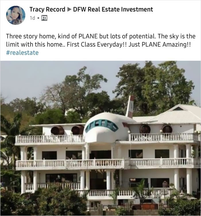
29. This Is Plane Awesome – Bad Architecture Examples
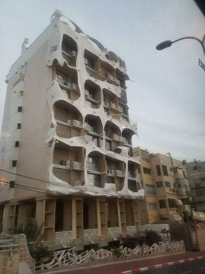
30. I Spotted This Gem In Tel Aviv – Bad Architecture Examples
“Don’t take it personally; we’re just trying to create an atmosphere where we can all have fun and be kind. There’s now the equivalent of a small city of us all here, so that will be more difficult,” Matthew pointed out. He added that mentions of politics and religion will be deleted while all potential new members have to answer some questions before they get in. This leads to a friendlier and happier community that, we’re sure, plenty of you A&D followers will want to join.
31. Kinda Reminds Me Of A Church (Granted, A Strange One), But It’s A House With A 6,000 Sq. Ft. Garage… And Its Car Wash
32. Surrealist Neighborhood
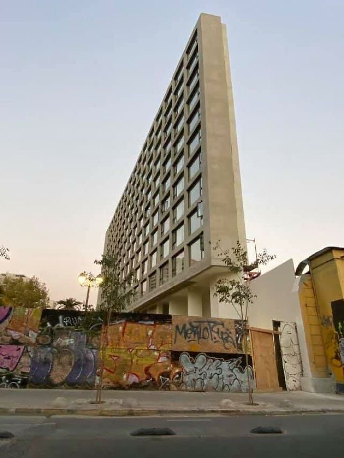
33. Forbidden Waffle In Santiago
34. This Building Has My City In A Uproar
35. Please Don’t Take It Too Seriously; Just A Surprised House
36. This Place Is All Curb Appeal
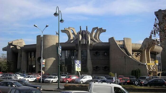
37. The Glorious Flower Of Communist Brutalism Is The Former Central Post Office In Skopje, Macedonia. Some People Want It Preserved
38. Just One Of The Bad Architecture Examples
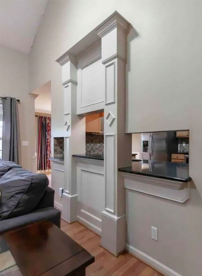
39. I’ve Been Looking At Homes, Trying To Get Ideas For When We Move In A Few Years, And I Came Across A House That Was Perfect In Every Way Except One
What in the ever living fudge is this – one pass thru is, ‘eh, but this one has three-at different levels plus the added detriment of the world’s worst architectural detailing around it. Please, someone else, tell me that you hate this as much as I do. I know it’s probably more interior design, but it’s so ugly.
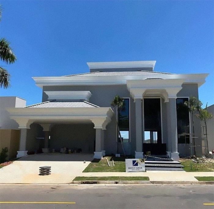
40. Car Dealership Trying For More Of A Classy Look!
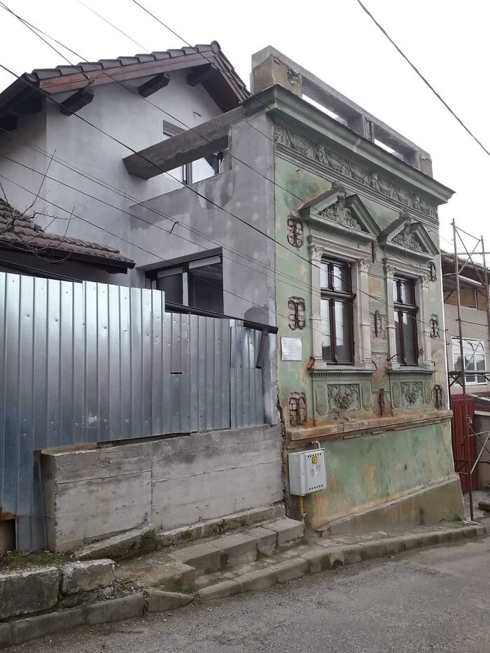
41. Keeping The Old Facade Because The Law Says So
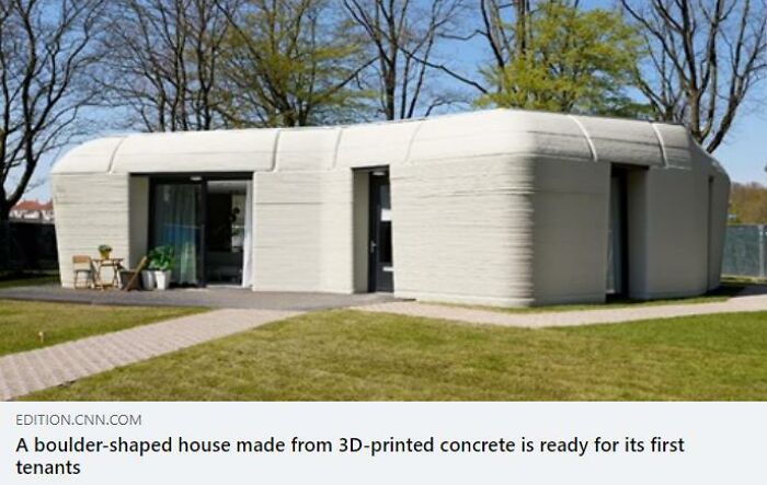
42. I Appreciate Efforts At Creativity, Sustainability, And Affordability. I Do. But Do They Have To Be So Ugly? This Looks Like A Bad Public Washroom
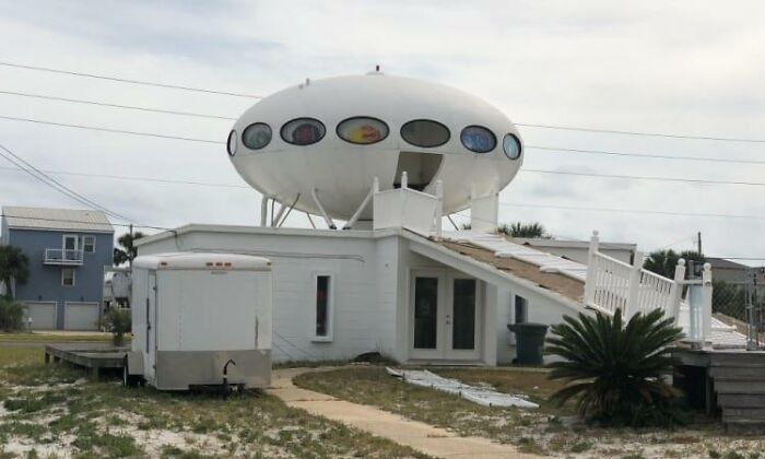
43. Pensacola House – Bad Architecture Examples
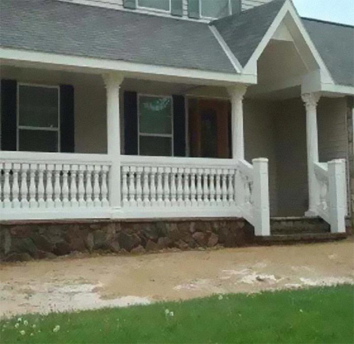
44. Victorian Balusters With Greek Columns. This Is So American It’s Painful
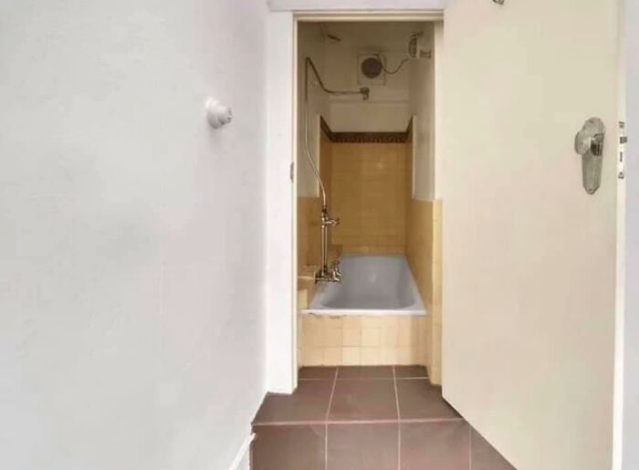
45. I Think They Put A Bath Where A Closet Was
46. If You Want To Live In A Cheesecake Factory And Enjoy Drafty Showers
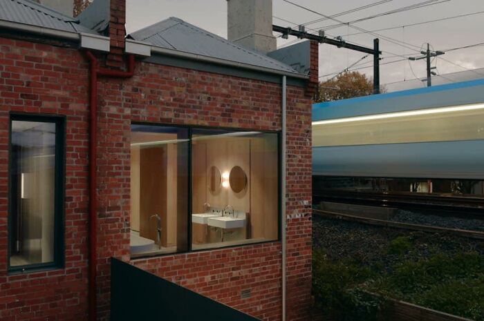
47. “The Clients Insisted On A Big Window In What Must Now Be The Least Discreet Bathroom In Melbourne.” Note The Train
There are no blinds or curtains. People on the train call the hotel downstairs & ask if they know they are baring all.
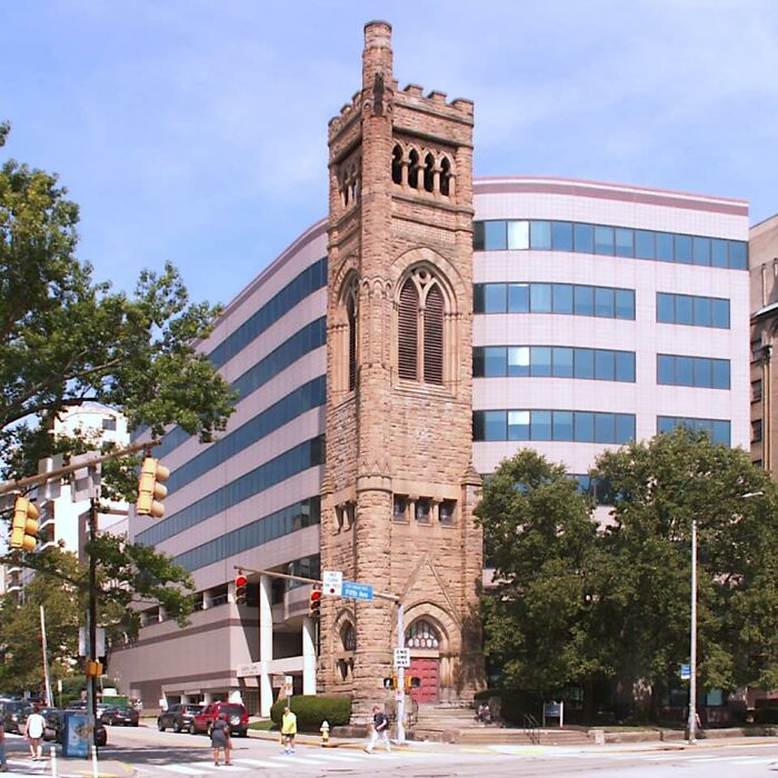
48. Here’s A Building In Pittsburgh. They Tore Down The Church But Left The Steeple. Built An Insensitive Building Behind It
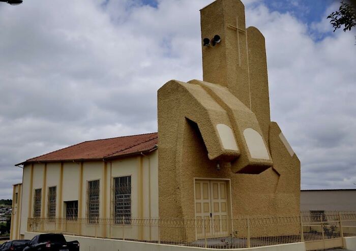
49. Saint Benedict Church, Andrelândia, Minas Gerais, Brazil. Built In 1989
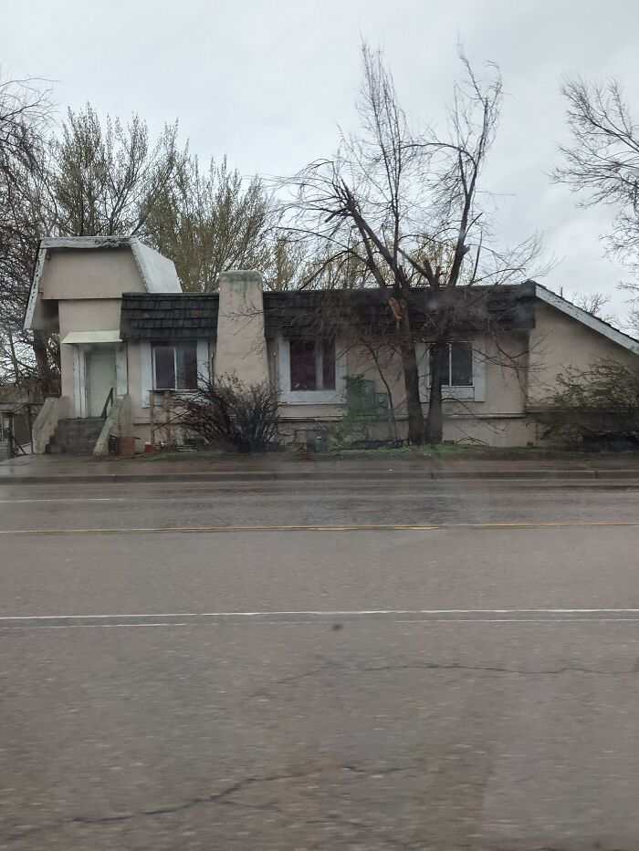
50. I Don’t Think A Paint Job And Landscaper Would Help This Poor House Down The Street From Me
Like what you’re reading? Subscribe to our top stories.














Discussion about this post