Hey there, logo enthusiasts! We sincerely hope you’ve had your daily dose of coffee because we’re about to take a wild ride through the weird and wacky world of logo design fails (I mean, who doesn’t like funny things?). So A&D Followers, strap in because we’re about to showcase some examples where designers took ‘thinking outside the box’ too literally.
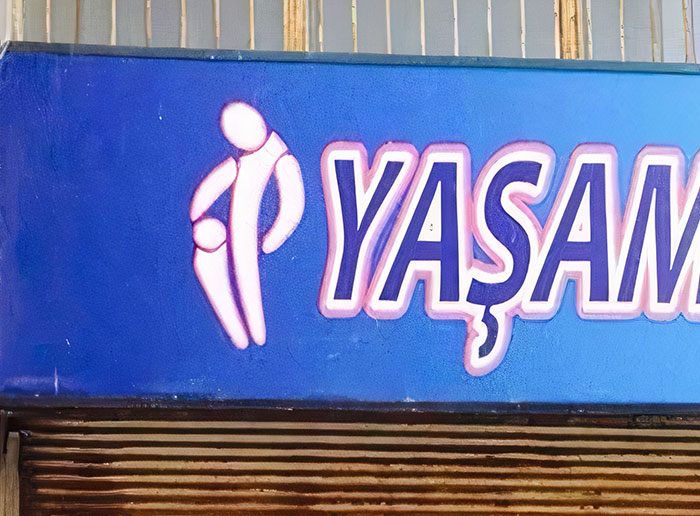
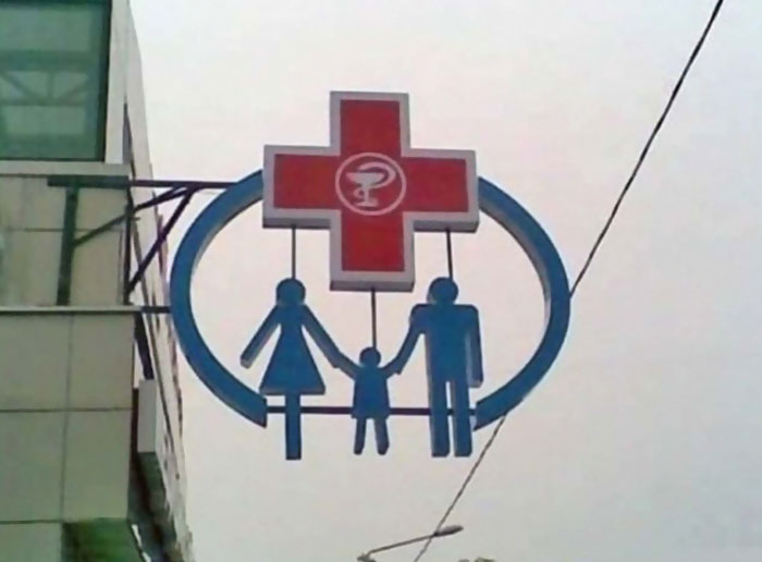
To kick off the post, we are starting with a real gem. We all know our local pharmacies, right? The place where we get our essentials, life-saving medications, and more. Now imagine a pharmacy that, for some peculiar reason, thought, “Yes, a hanged family would make a great logo for our company.” Man, you’re probably thinking, “No way?! How did someone not see anything wrong with this before it went up?” Buckle up because this is only the tip of the iceberg regarding the logo fails you will see as you scroll down below.
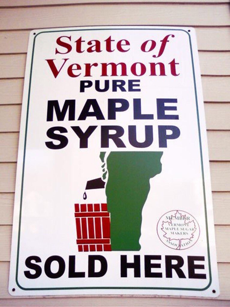
01. Vermont Maple Syrup Logo
02. iSmart’s Logo Really Thew Me For A Second
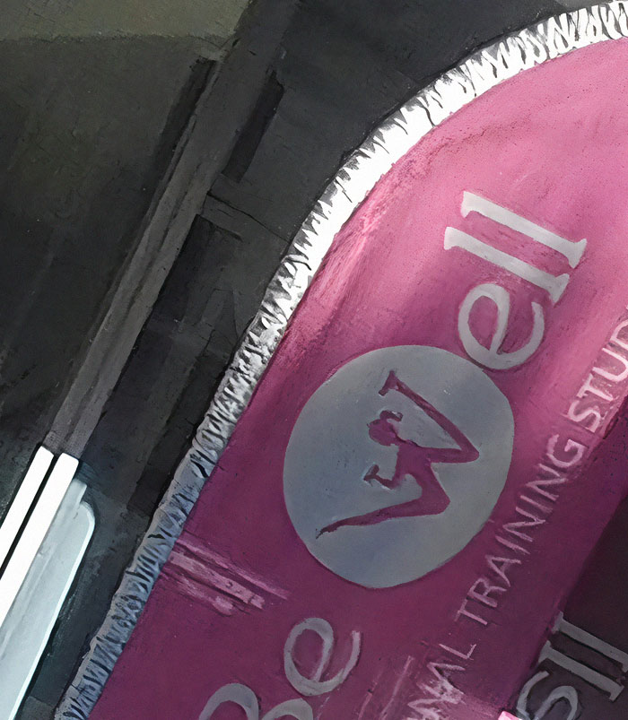
03. An Unfortunate Logo For A Fitness Center
But how do these unfortunate logos come to be, you may wonder? And more puzzling, how do they get past marketing teams and into the public eye? Well, usually, one of the main reasons these logo fails to occur is due to a lack of research and planning. A well-designed logo requires a deep understanding of the brand, its values, target audience, industry trends, etc.
04. Not The Greatest Logo
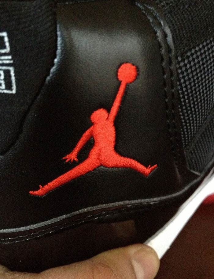
05. I Ordered Jordan’s Online. Got Fake Ones, Jordan Logo Has An A*s Crack. WTF Lol
06. This Logo Of A Turkish Water Brand. It Sucks
It’s not just about creating something visually pleasing (well, in the case of this post, perhaps this shouldn’t be applied); it’s about creating something that accurately represents the business and resonates with its consumers. When these factors aren’t considered, you end up with logos that seem absurd or highly inappropriate in context…
07. Don’t Overthink This; It’s Just A Handball Club Logo
08. This Store Is Called Jupiter; Their Logo Is The Moon
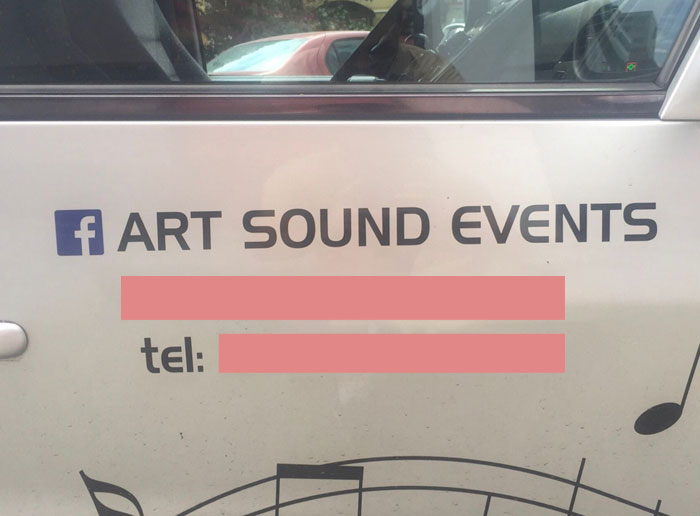
09. Unfortunate Placement Of The Facebook Logo
Of course, another case for failure may be due to the design being reviewed in isolation without considering how it might be perceived in the real world, or it might be that those reviewing the logo are too close to the project to see potential problems. Like when you are working on something for such a long time that your perception of it becomes frazzled (especially if you don’t get feedback on it).
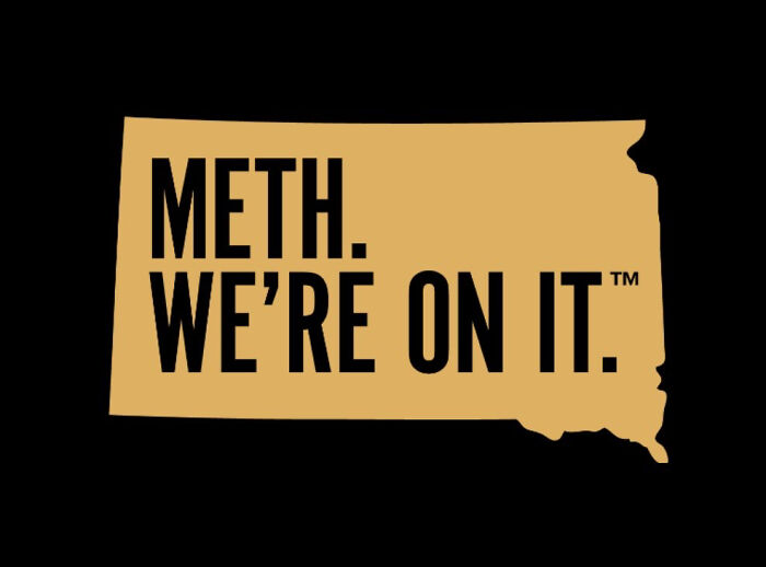
10. South Dakota’s Logo For A New Anti-Meth Campaign
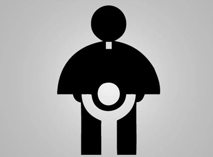
11. The Logo For The 1973 Archdiocese Youth Commission
12. “Yes, A Hanged Family Would Make A Great Logo For Our Company.”
So A&D Followers, with all of that out of the way, tell us, which of the failed design logo was your favorite and why? We look forward to your answers under the photos and the post itself.
And remember, even if something doesn’t turn out perfect on the first try, it’s always possible to learn from the mistakes of others and make necessary adjustments. As these examples show, even the best of us can sometimes fail when working on something for far too long…
13. Logo Of My Local Doctor’s Office
14. I Feel Like Someone Should’ve Noticed How Bad The Logo Is
15. This Logo Design!!
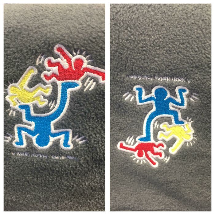
16. Logo For A Children’s Hospital. Right Side Up Is A Man Juggling/Playing With Kids. Upside Down Is An Angry Man Stomping On Kids
17. Your Logo Designer Is Still Laughing
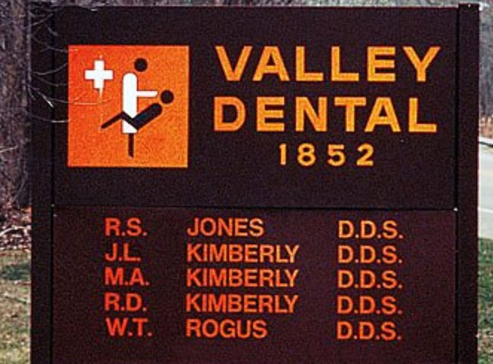
18. This Dentist’s Choice Of Logo Near My House
19. This Church Near My House Should Probably Rethink Their Logo
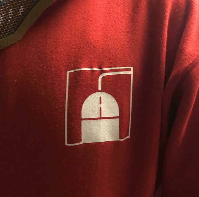
20. The Logo For My Son’s IT Class At School
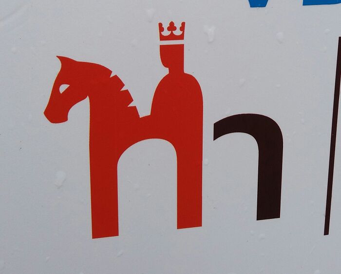
21. This Logo Of The Czech Sausage Company
22. This Is The Logo From A Local Dispensary
23. The Unfortunate Logo Of A Florist Near Me. I’ve Been Calling It Std’s For Years. It’s Sid’s
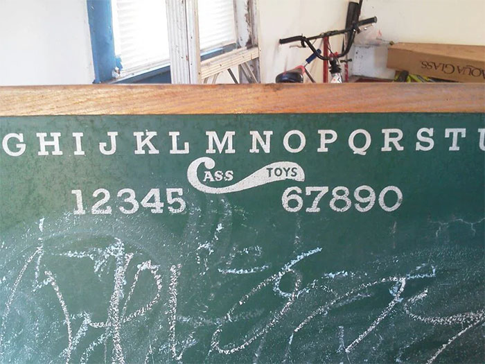
24. “Cass Toys” Didn’t Think Their Logo Design Through Too Well
25. Probably The Worst Logo I’ve Ever Seen. It’s For A Plastic Surgeon
26. This Horrific Logo
27. Ontario’s Logo (Trillium Flower) Looks Like 3 Dudes In A Hot Tub
28. This New Sushi Restaurant Logo Has A Racist Cra*py Design
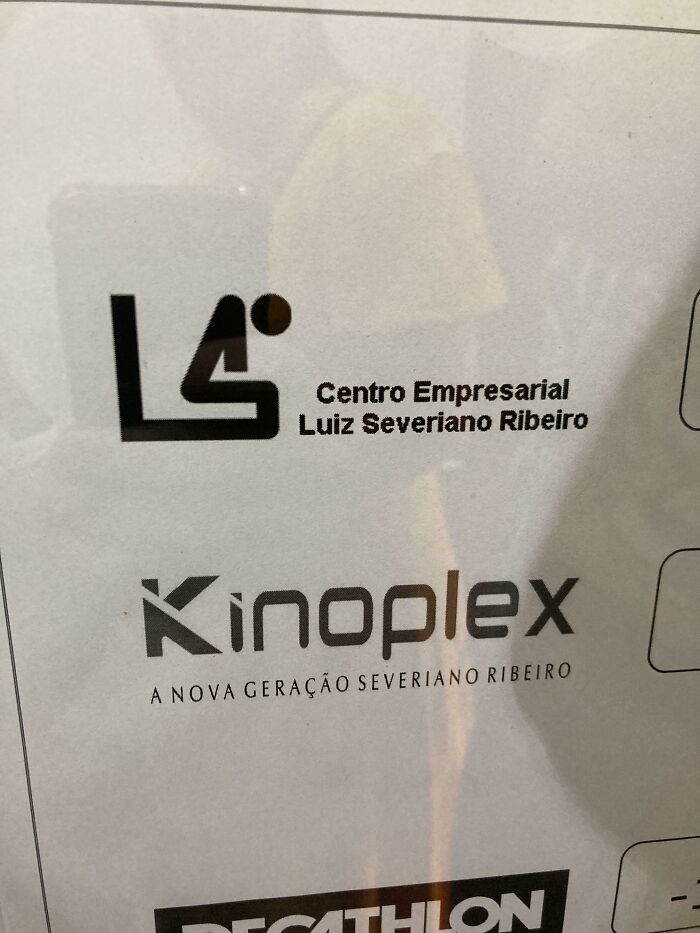
29. Business Center Logo Looks Like A Guy Taking A Dump
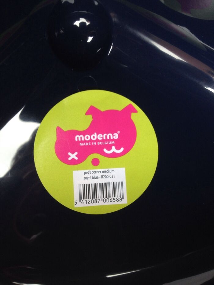
30. This Pet Supplies Company’s Logo Is Meant To Depict A Cat And A Dog, But What I See Is A Dead Bird
31. This Bank Logo In My Hometown
32. Logo Is Having A Bad Case Of Diarrhea
33. Russian Bread Company Logo. Literally Cra**y Design
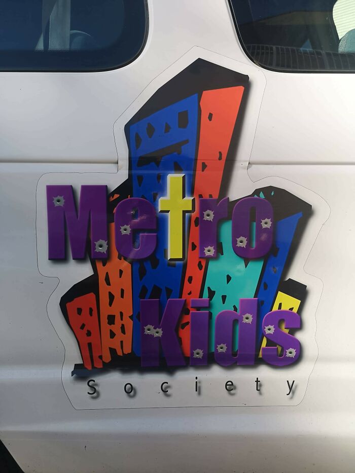
34. This Kids Society Logo… The Bullet Holes Are An Interesting Touch
35. Someone Paid Money For This To Be Their Sign And Logo/Mascot. I’m Convinced This Is Drug Lord’s Money Laundering Business
36. My School’s Logo Looks Like A Crying Face
37. They Really Need A New Logo
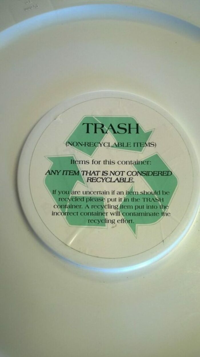
38. Then Why Use The Recyclable Logo?
39. Quite A Bizarre Logo
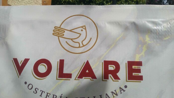
40. This Logo Of A Bird Also Looks Like A Character Wearing A Puking Hat
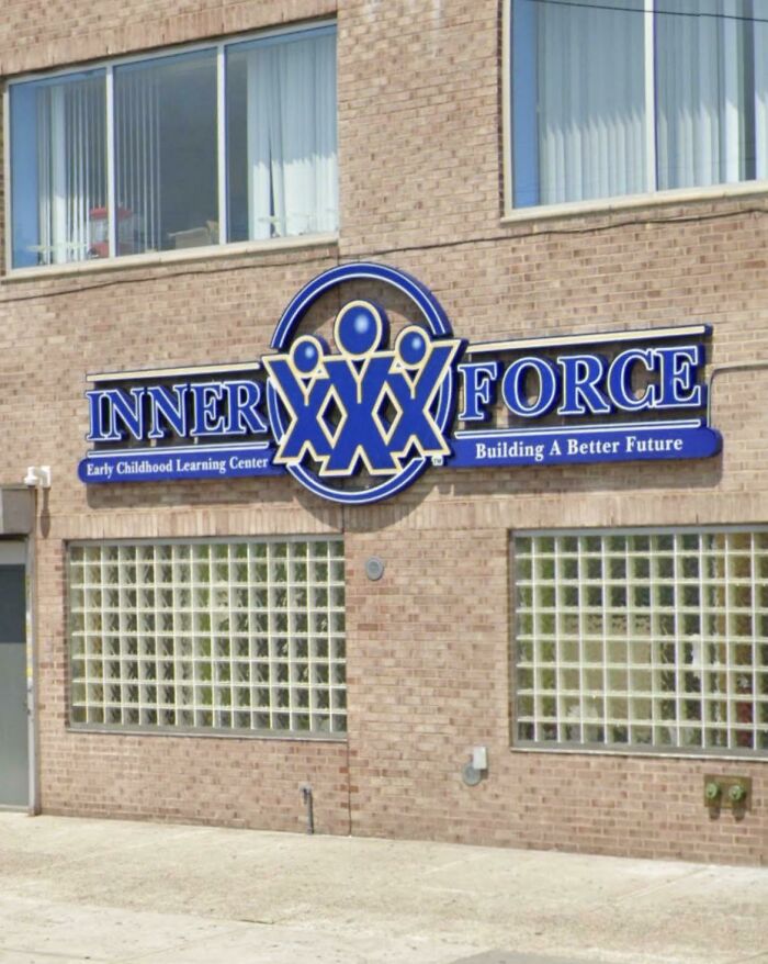
41. Childcare Logo Looks Like XXX
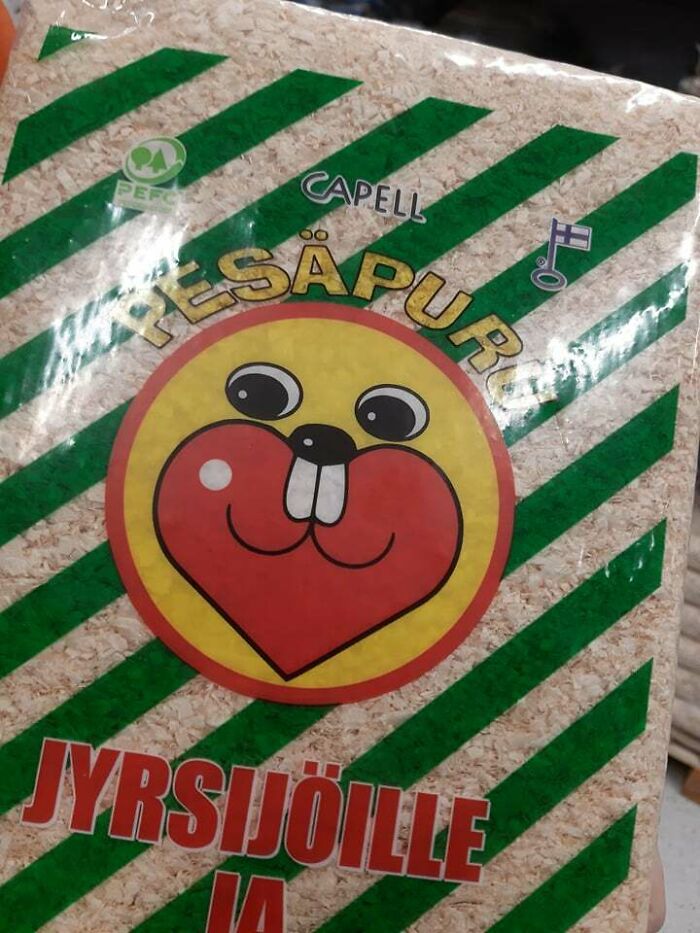
42. Rodent Logo With Teeth Coming Out Of Its Nose Instead Of Mouth
43. This Logo Design By Square Enix
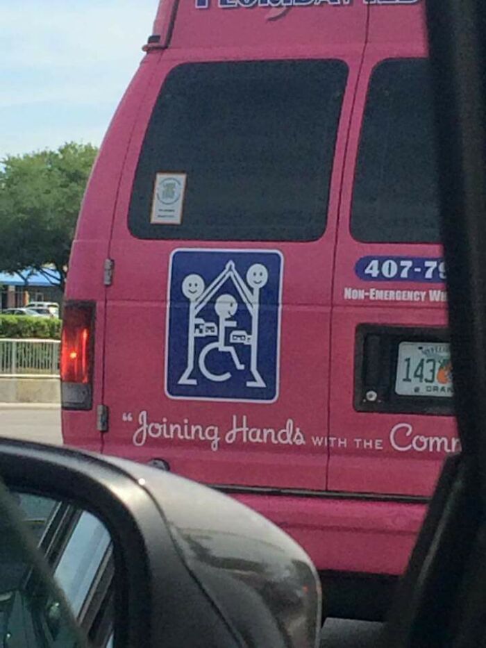
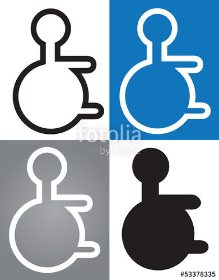
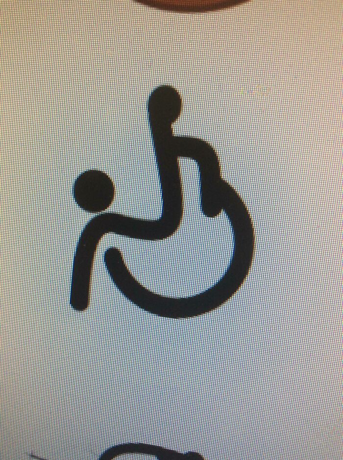
44. This Disability Logo
45. The Brazilian Cinematheque Logo
46. The Logo For Wheelchair Rugby Looks Like A Guy Falling Off A Wheelchair
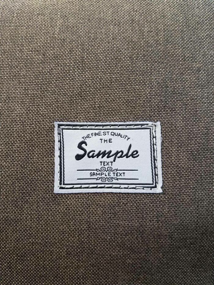
47. This Backpack Logo
48. This Kindergarten Logo
49. What Does This Logo Even Say?
50. The New Logo Of My University
Like what you’re reading? Subscribe to our top stories.

























Discussion about this post